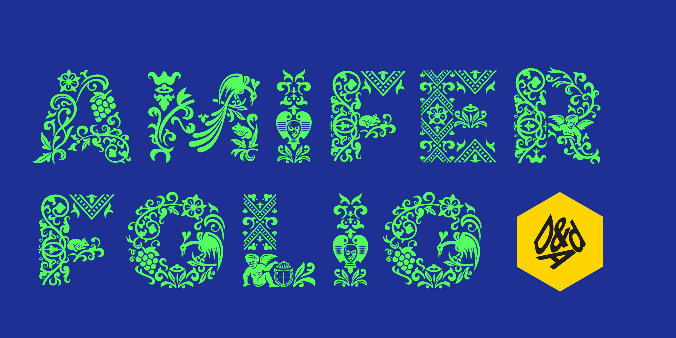
Amifer Folio: bespoke font for Shakespeare’s Globe
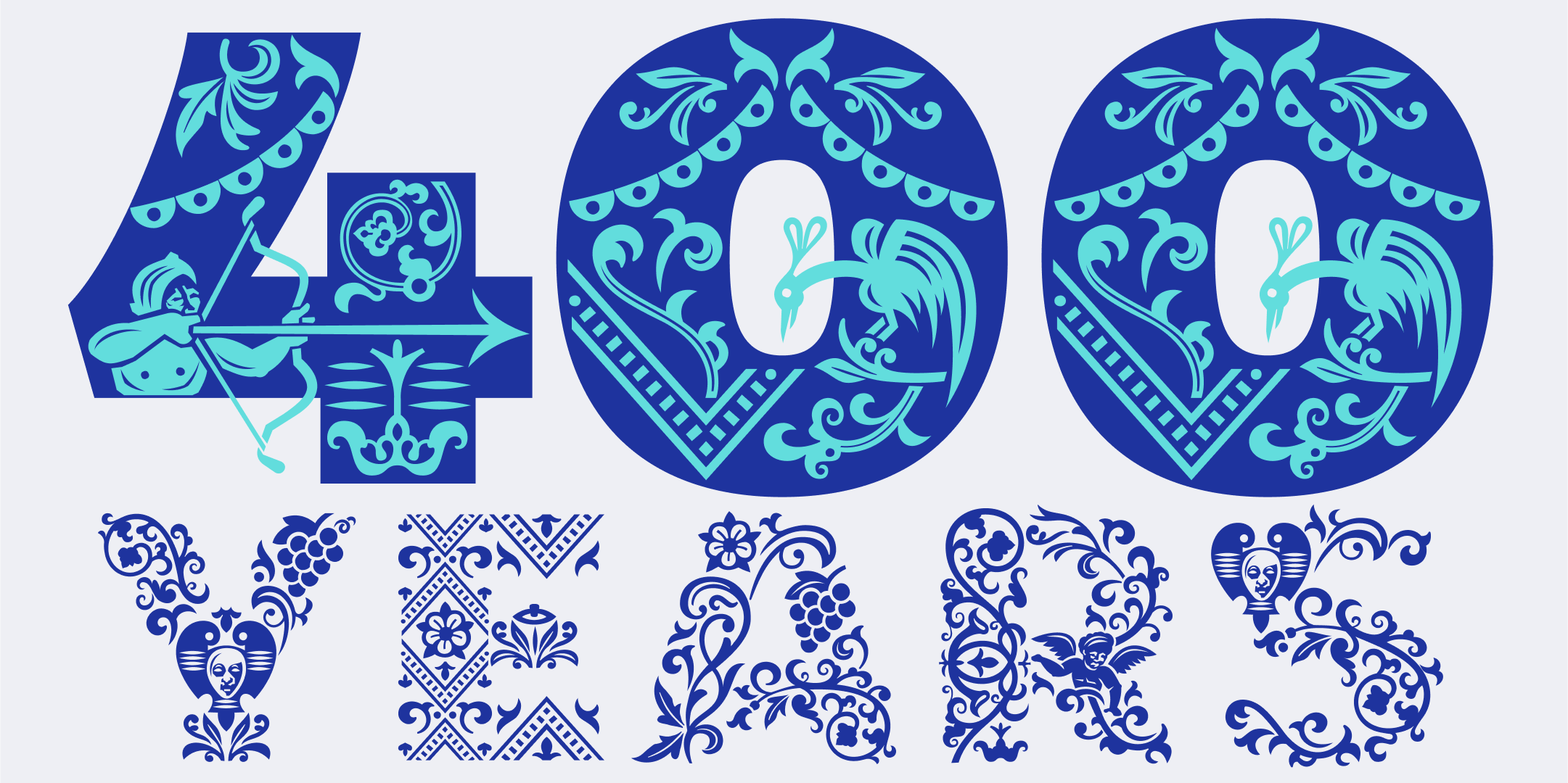
2023 marks the 400th anniversary of the publication of the First Folio, the first collected edition of William Shakespeare’s plays. The volume was published in 1623, seven years after Shakespeare’s death, and it contains 36 plays, half of which were not previously been printed and would have been lost to us today. To celebrate this historic occasion, the Shakespeare’s Globe theatre in London has organized a season filled with exciting events, and they have launched a brand new campaign to pay homage to the First Folio. The Globe’s design team has been using Typeland’s Amifer font family since the 2022 summer season, making great use of the font’s design characteristics and quirkiness (in case you missed it, we wrote about it earlier here), and they continued using Amifer for their 2022 winter campaign. So we were doubly excited to know that the Globe’s creative directors Irene Omodeo Zorini and Louise Richardson wanted to extend things in a new direction with Amifer once again for their new summer campaign for 2023.
This time, the Globe’s design team wanted to collaborate with us to create a custom display style for Amifer that integrated elements from the First Folio. The key idea was to create decorative features that could work seemlessly with Amifer’s Black weight, rather than relying on separate illustrations that would need to be adjusted for every use. As we considered the various scenarios where these letters would be used, we were faced with an interesting challenge: we needed to create a design that could be easily applied and scaled to meet the needs of the campaign.
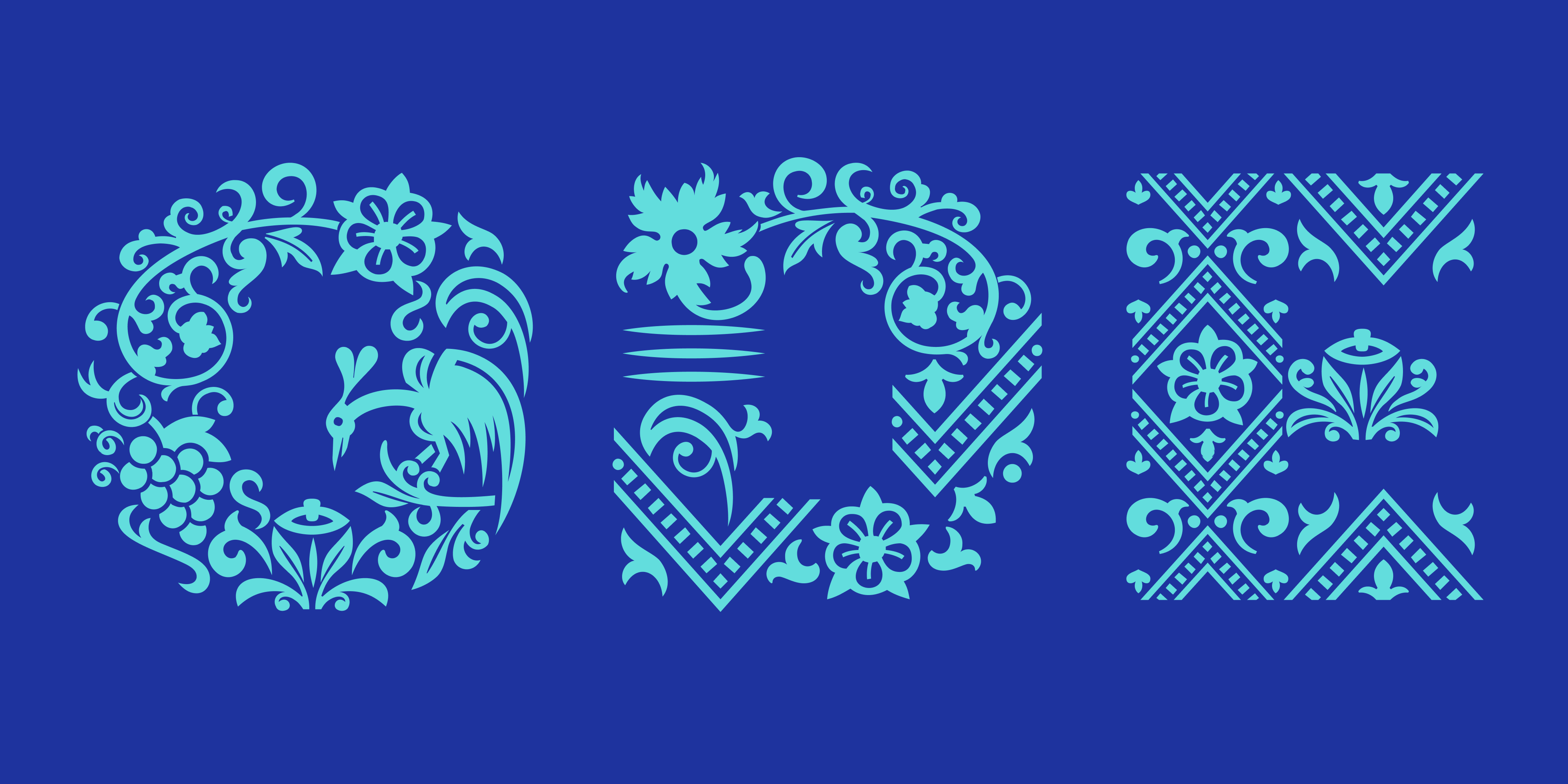
Using elements from the decorative imagery and patterns that appear in the First Folio, we came up with the idea of designing a bespoke layer-font: Amifer Folio. The design team at The Globe provided us with their initial ideas about elements that needed to be part of specific letters, that would reflect the particular plays where the letters would appear as decorative initials. e.g. a wavy top of T for The Tempest, a sense of menace and danger in M for Macbeth, and so on. Using these initial ideas as a starting point, we worked more broadly through the Folio’s pages, interpreting and drawing a set of elements that could form the basis for the overall illustrative thematic treatment.
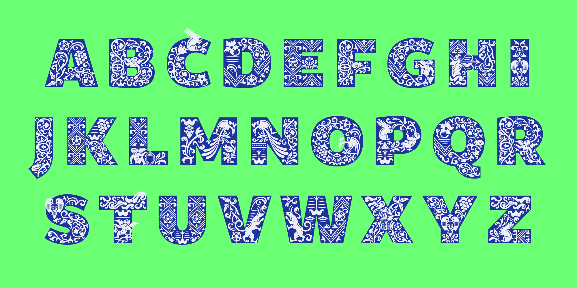
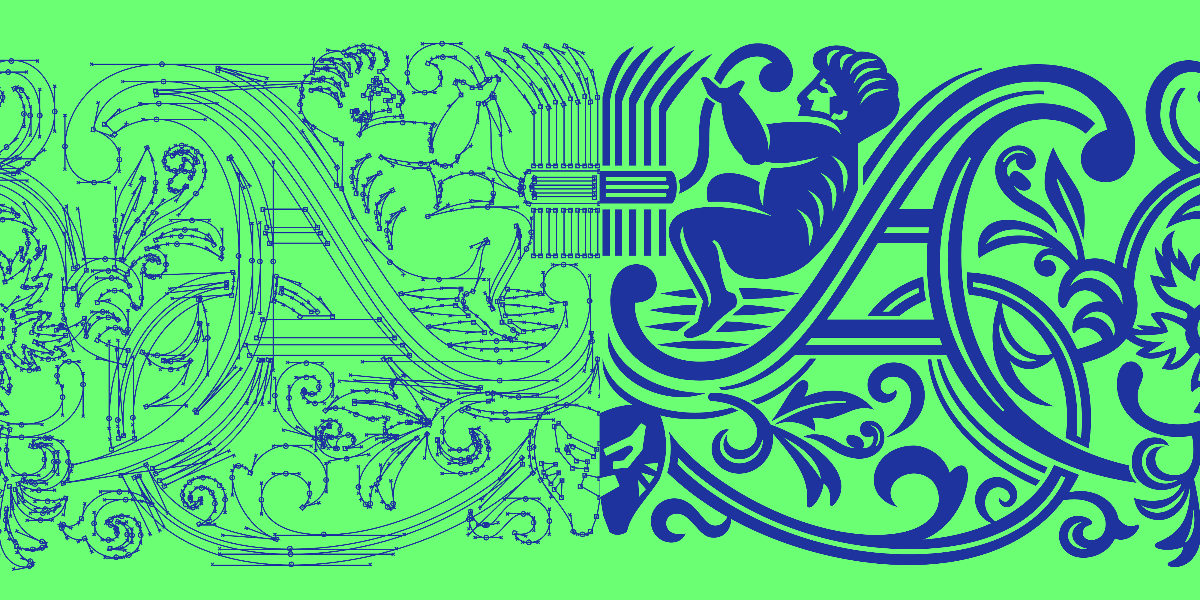
The challenge was to pick up specific elements from the original patterns and illustrations that appear in the First Folio, but also to interpret them cleanly as vector shapes relevant to and usable in a font format. Some of the elements could be quite tricky to figure out from the original printed pages of the Folio. The woodcuts were printed to function at a specific scale only and it can be challenge to resolve their form in a way that can work in a digital font when used at different point sizes.
It was equally important to create combinations and variations that were intricate in their design, but that could also work across at least two different scales. This meant creating a design that would work effectively at varying sizes and levels of detail, depending on how big or how small the initials were in a given scenario. To achieve this, we opted to create two separate styles in the type family: Amifer Folio Small serves as the base layer of elements with simpler details, while Amifer Folio Big, features a greater number of elements and fills, providing a more impactful presence at larger sizes. By creating these distinct layers we were able to achieve a level of versatility in the typeface that enables it to be used in a range of different contexts without appearing too light or too dark in the decorative layer.
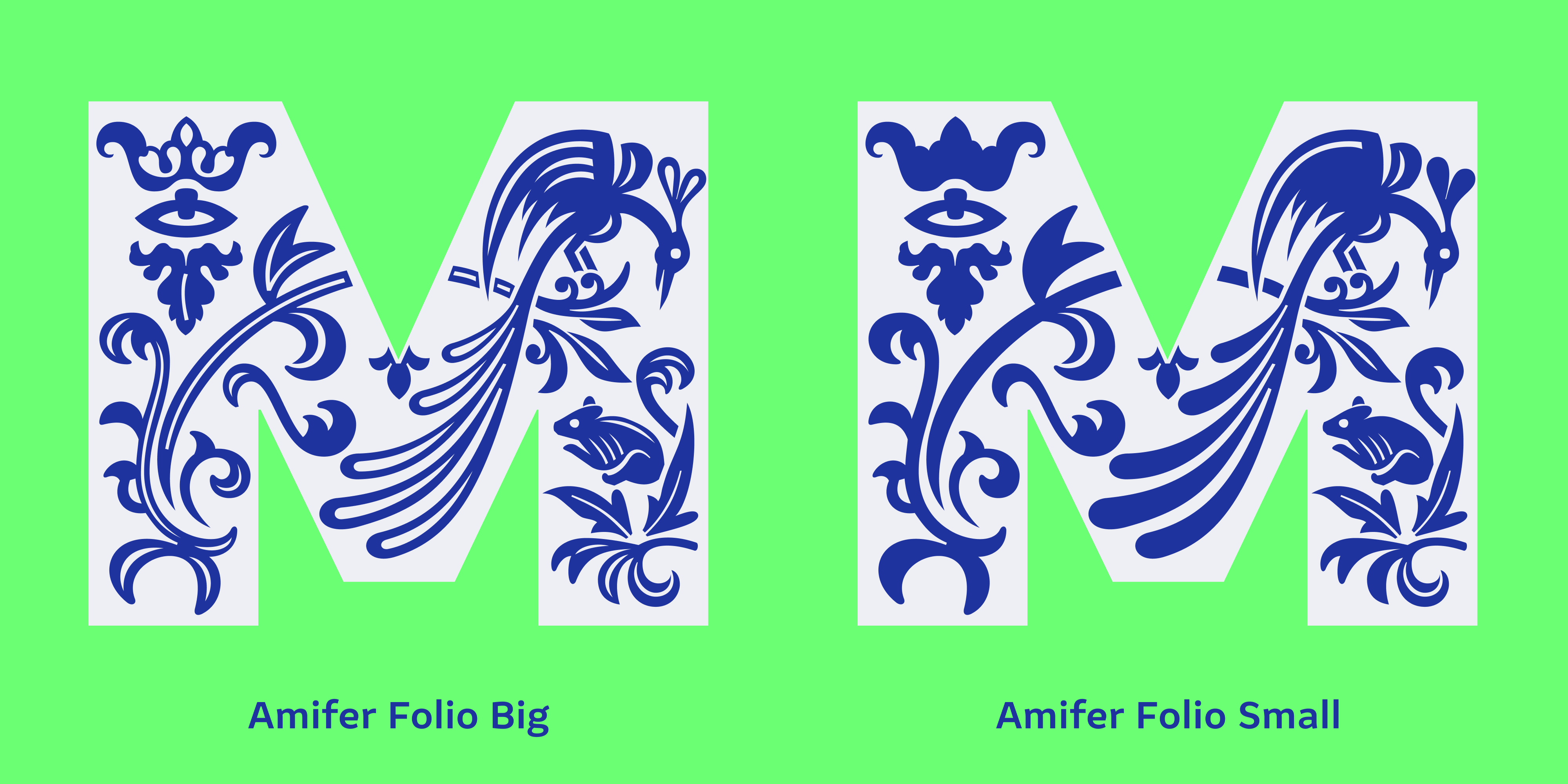
Amifer Folio Big and Amifer Folio Small share the same proportions and metrics of Amifer Black, and can be placed directly over it to create intricate decorative effects. This gives the design team at The Globe a quick and reliable way of dealing with illustrated initials – with a lot less time and effort required compared to placing vector illustrations and tweaking them for each use. Since the Folio elements have largely been adapted to follow the outlines of the letterforms, the two decorative layers can also be used on their own without the need for the letter-outlines at the back.
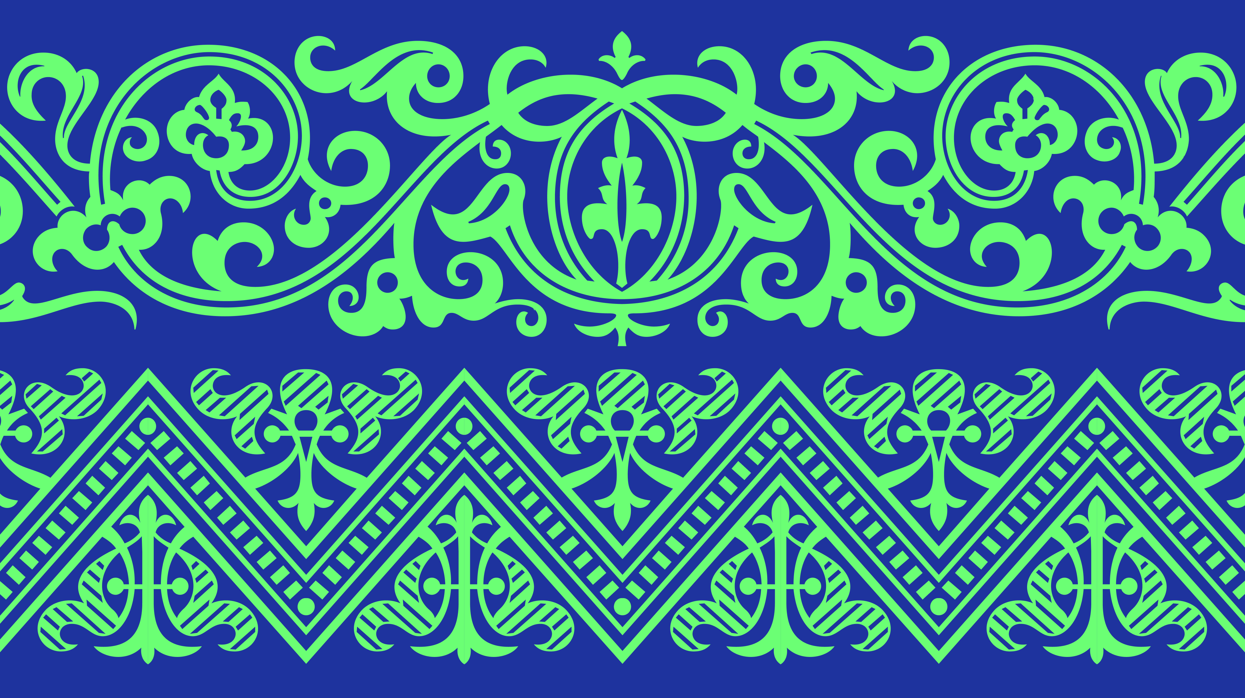
Each style makes use not only of the peculiar cast of characters (i.e. angelic and demonic entities, symbols, masks, gargoyles, flora and fauna) that appear in the First Folio illustrative blocks, but also some of the pattern elements that mark the beginning and end of various sections. These patterns have also been carefully drawn to be used on their own, spaced in a manner that ensures that they can be seamlessly repeated, and these have been made easily accessible via OpenType features for the team at The Globe to experiment with.
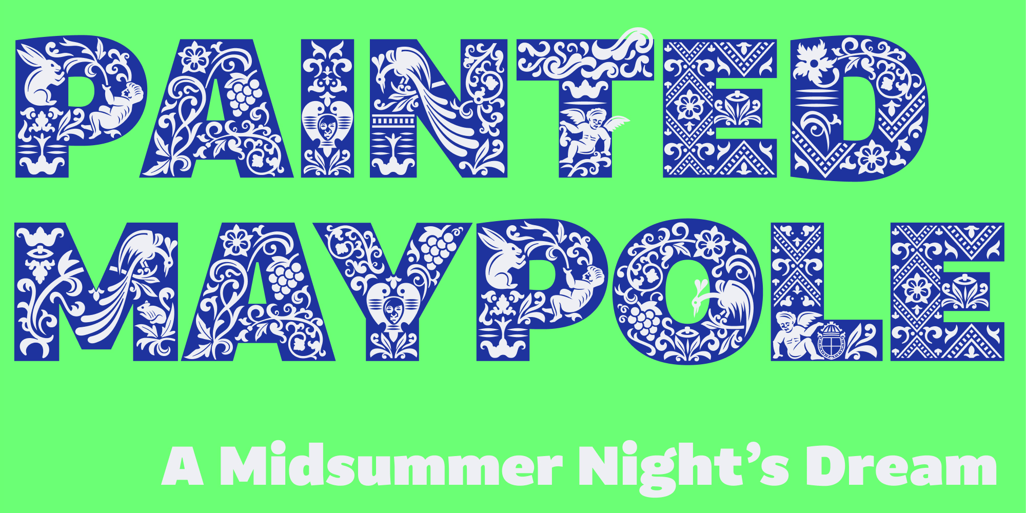
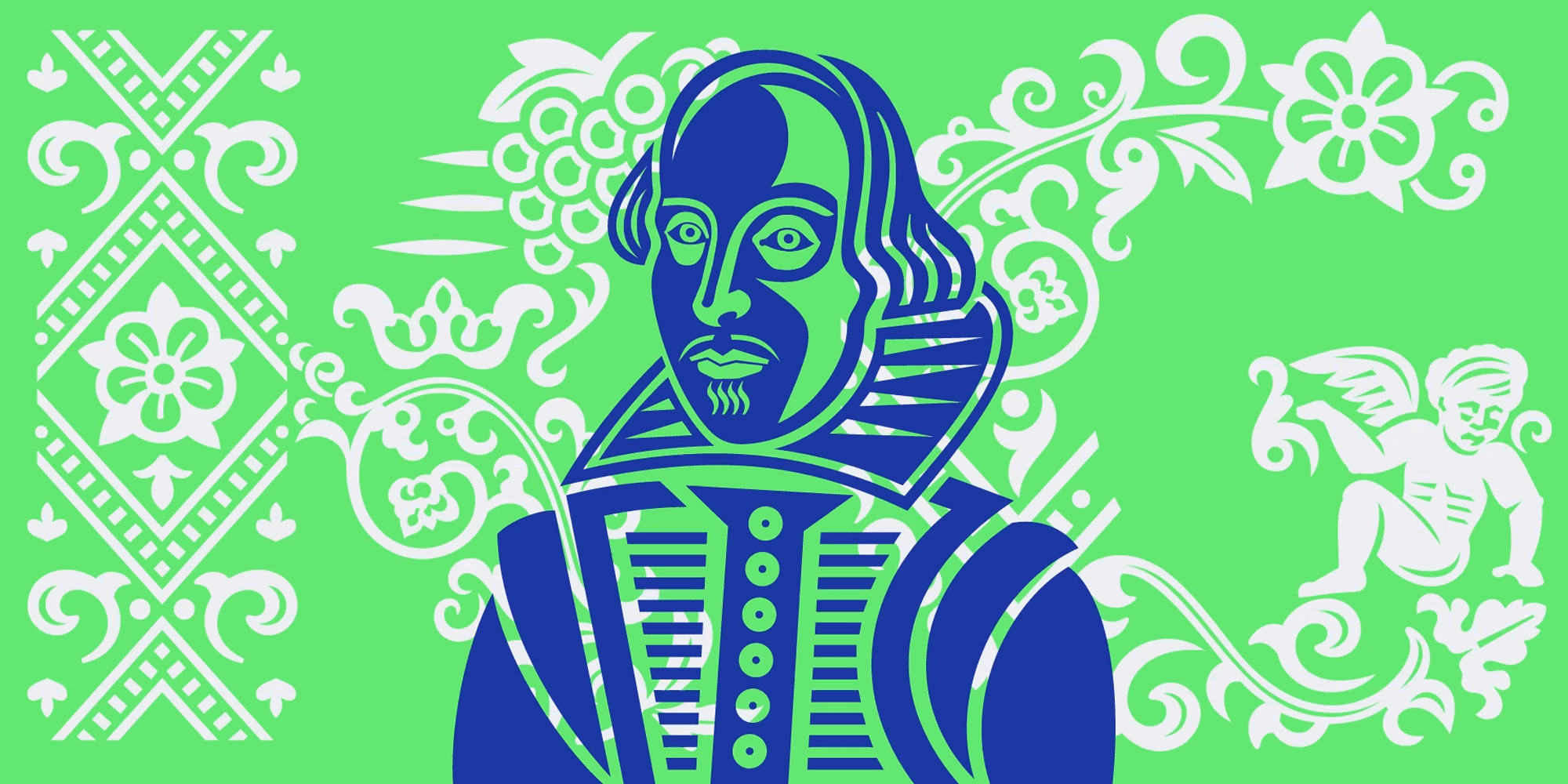
And lastly, there is a special Shakespeare glyph, the famous likeness of the man himself – with a particularly dandyish take on facial hair that the bard may or may not approve of!
[This typeface won a pencil at the 2023 D&AD awards in the Type Design and Lettering category.]
• • •
Typeland is an independent type design studio based in south London. See our library of retail fonts and get in touch with us for any enquiries or custom design projects. We are always happy to discuss potential collaborations – contact us with your requirements.