Djaggety: designing with productive constraints
Not every project needs months or years of work. But there’s a part of me that still feels that time is what gives something its value, that if it was quick, it couldn’t possibly be deep. This project, however, challenged that idea a little.
Djaggety began as a classroom exercise. I teach the basics of type design to BA Graphic Design students, and one of the first assignments is always the same. We start with a simple setup: an 8×8 grid and a single module. The brief is deliberately limited. Students can use any shape, but they have to build a working alphabet out of it. That’s it.
The grid becomes a constraint by design that functions as a teaching tool. It productively reduces the bewildering array of choices and directions, making students focus on the essential structure of each letter within a clearly defined set of possibilities. It’s a quick way to understand what makes a letter recognizable, and what could make a typeface tick. There is a kind of forced clarity built into the system. It is hard to go completely wrong, but when something is off, it is immediately obvious. That contrast helps students develop both their eye for design and their judgment, and it opens the door to discussing rhythm, spacing, and the quirks of different letterforms.
Over the years, I have seen how this kind of exercise reveals the inner logic of type design. It gives students a direct, tangible sense of what consistency (but also lively variation) actually means.
This year, I decided to join them. I drew live on screen alongside the students, showing my process as they worked through theirs. It helped me talk through decisions in real time, even to show that frustration is part of the process, and to share how I deal with problems as they come up. By the end of the sessions, I was left with a bunch of shapes that made me think: why not turn it into something?
So I kept going. And, inevitably, I ended up facing the same design dilemmas and constraints that I had assigned in my student exercise.
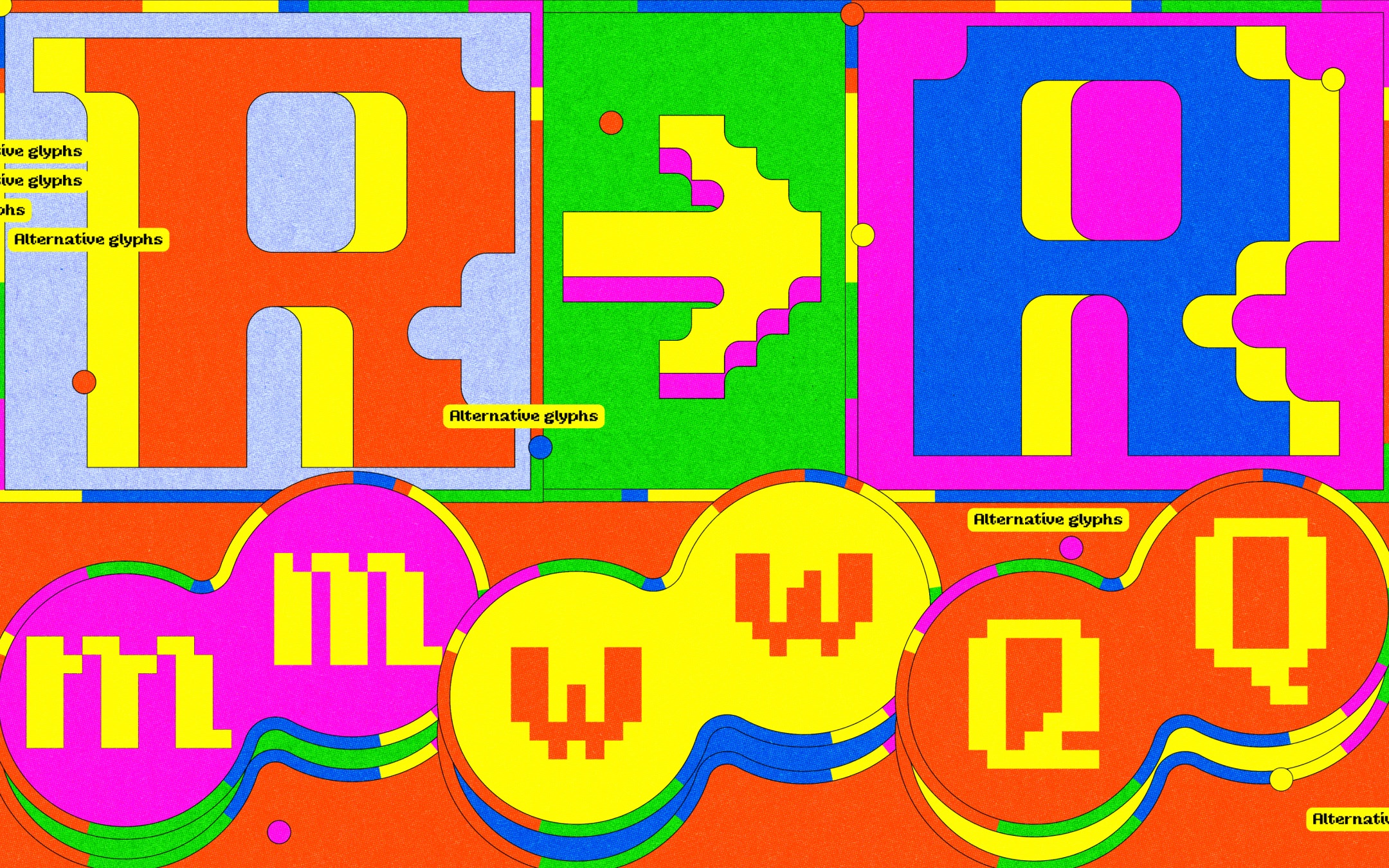
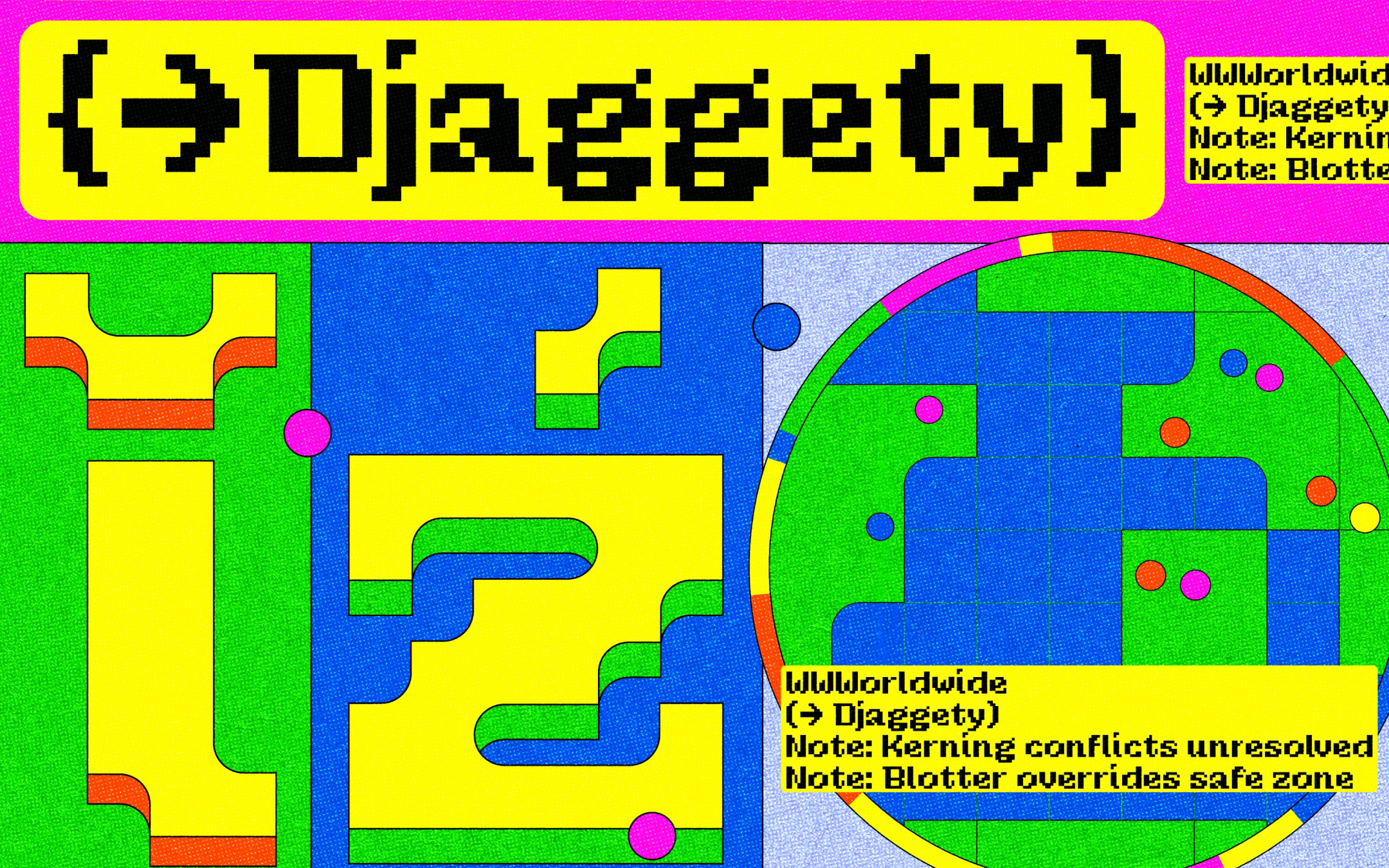
Kerning, for example, should have been easy with such a strict grid. But it became a maze of compromises. Letters like m, n, and h had tails that pushed the spacing out. I had to choose: keep the tails, accept the extra line of space, and hold onto a bit of fun, or trim them off for a more regular rhythm and lose some of that character. Neither option felt entirely right, but I had to decide.
What caught me off guard was not the limitation itself. I knew what I was getting into. I just hadn’t realised how conflicted I would feel inside it. I am used to adjusting by fine margins, nudging letters one unit at a time, testing subtle variations to find the best balance. With this grid, however, everything moved by hundreds. There was no middle ground. I could not adjust anything by a few units or shift things slightly into place. Every move was visible. I did not want to break the system just to squeeze in cleaner kerning or perfect diacritic placement. So I worked with what was there, not around it.
When you are used to adjusting by fractions, a grid that moves by hundreds forces a different kind of thinking. Less finessing, more accepting.
It was a sharp contrast to the refined micro-decisions we are used to making in professional type design. This grid came with brute, binary limitations. That shift was both freeing and maddening.
Width became another issue. I am not usually a fan of alternates, but in this case, they made sense. I kept narrower versions of certain letters, just enough to introduce some flexibility in specific combinations without breaking the overall rhythm. I also added initial forms of some capitals.
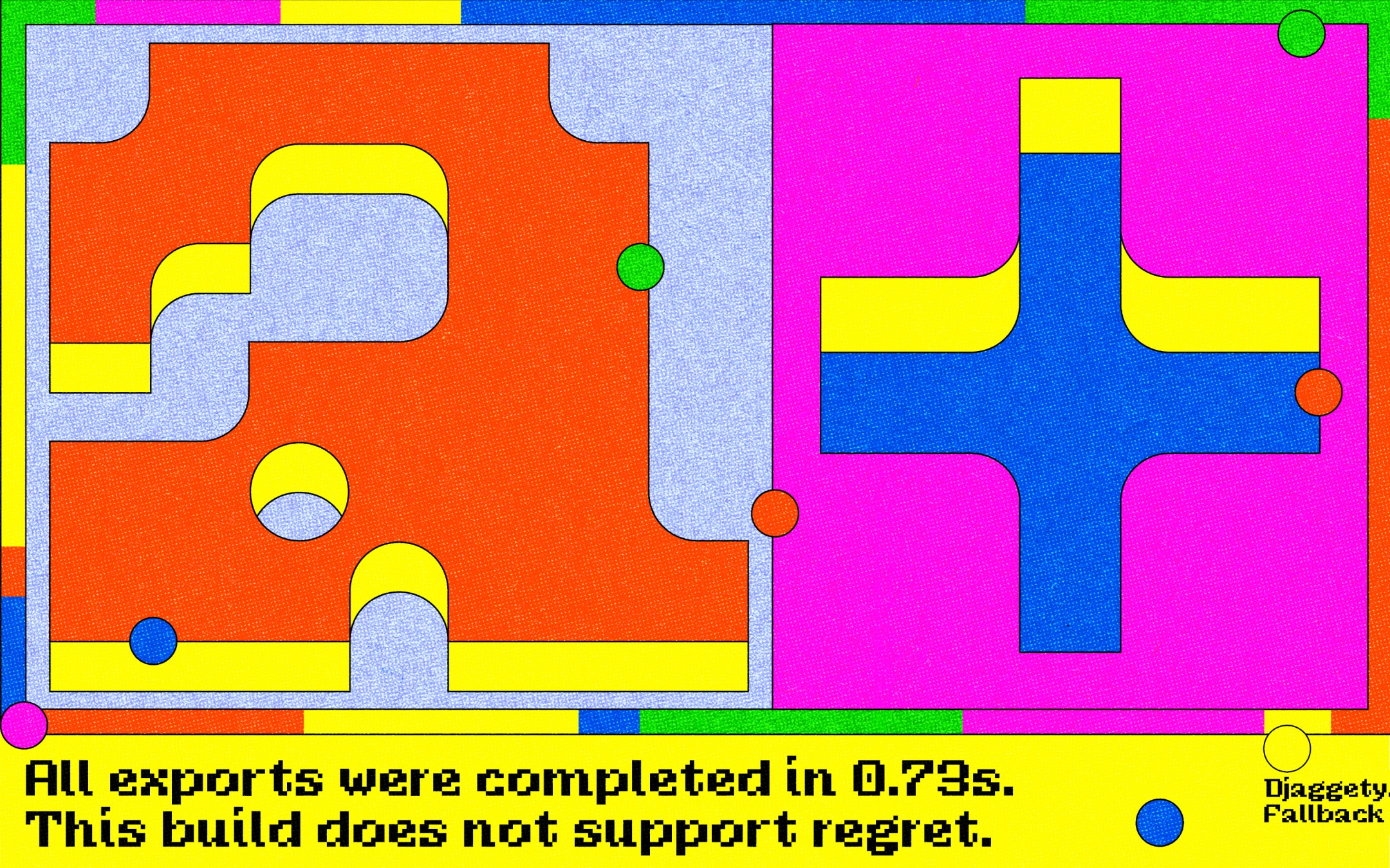
And that is how Djaggety came to be. A three-style pixel font that began as a teaching tool and grew into a proper typeface for fun and experimentation. It is modular, expressive, and a little unruly in places. But perhaps that is where its charm lives.
• • •
Typeland is a type design studio focusing on custom fonts and multi-script typography. Whether you need a custom design, retail font-library extension, or multi-script typefaces that perform across scripts, we’d love to talk – contact us with your requirements.