Proxima Nova Devanagari
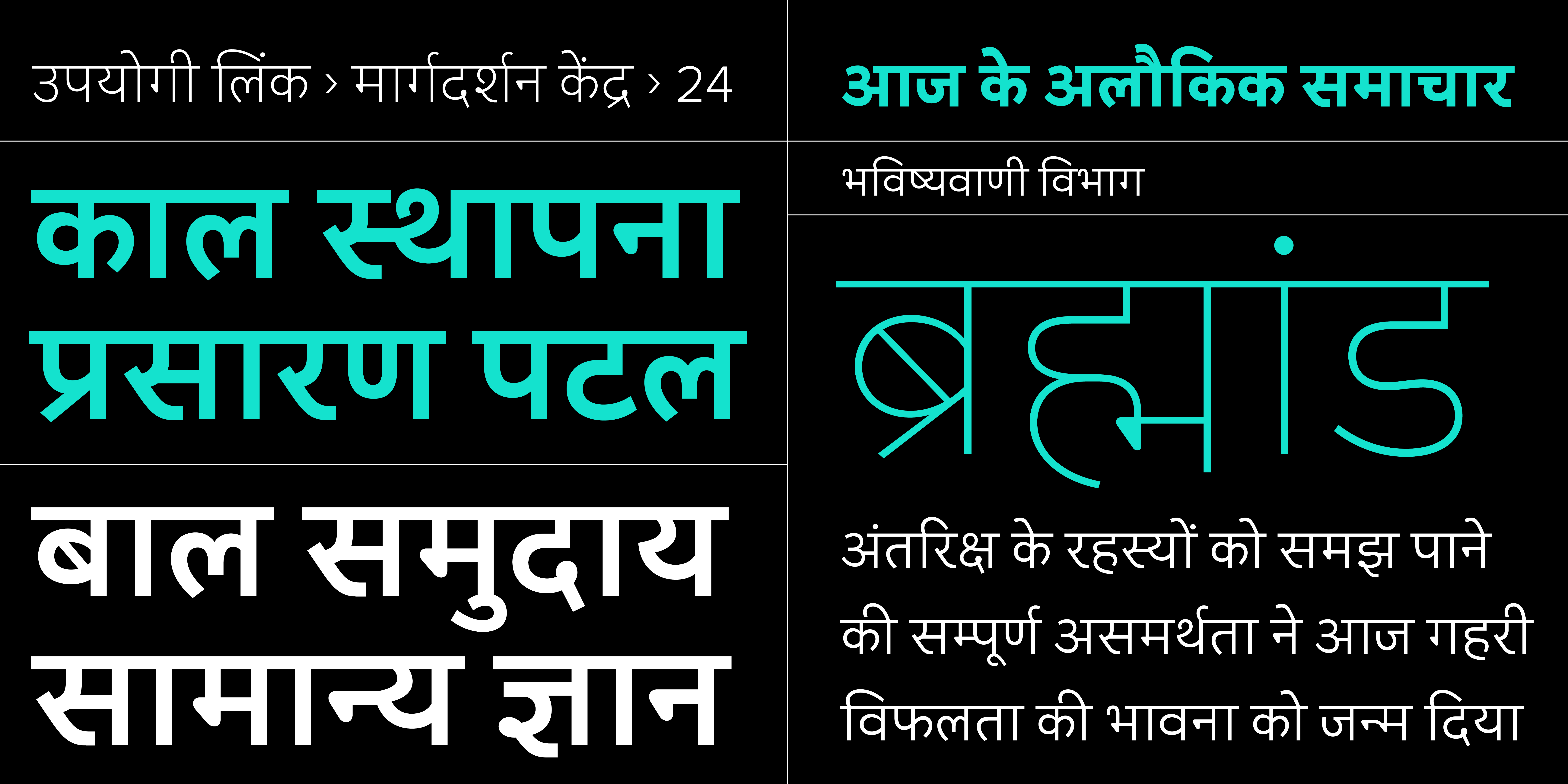
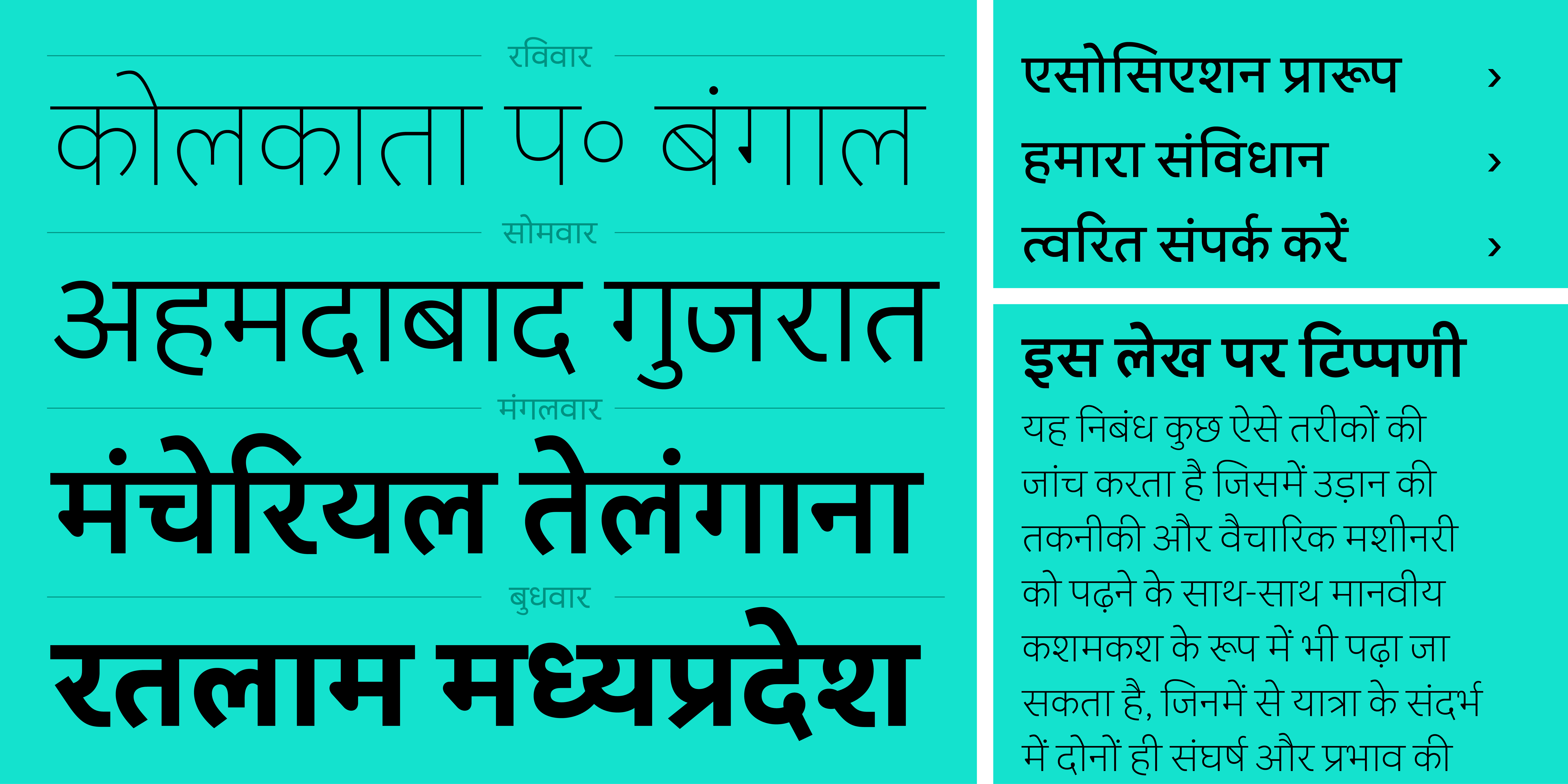
When The Type Founders approached us to design a Devanagari companion for Mark Simonson’s much-loved Proxima Nova family, we saw it as an exciting and uncommon opportunity: to work on expanding the reach of one of the most widely used typefaces on the internet, and to test what it really means to design thoughtfully for multiple scripts.
Proxima Nova can be found in use everywhere, from editorial matter for online media to software and app interfaces, from lifestyle content to finance and tech sectors. It is geometric and neutral in style with generous overall proportions and subtle features that make it an interesting hybrid. The challenge for us was to create a Devanagari that could carry similar qualities in its own context of use, without distorting the script’s natural structure.
We didn’t begin with predetermined styling. We began with what works for Devanagari, and what is meaningful in that context.
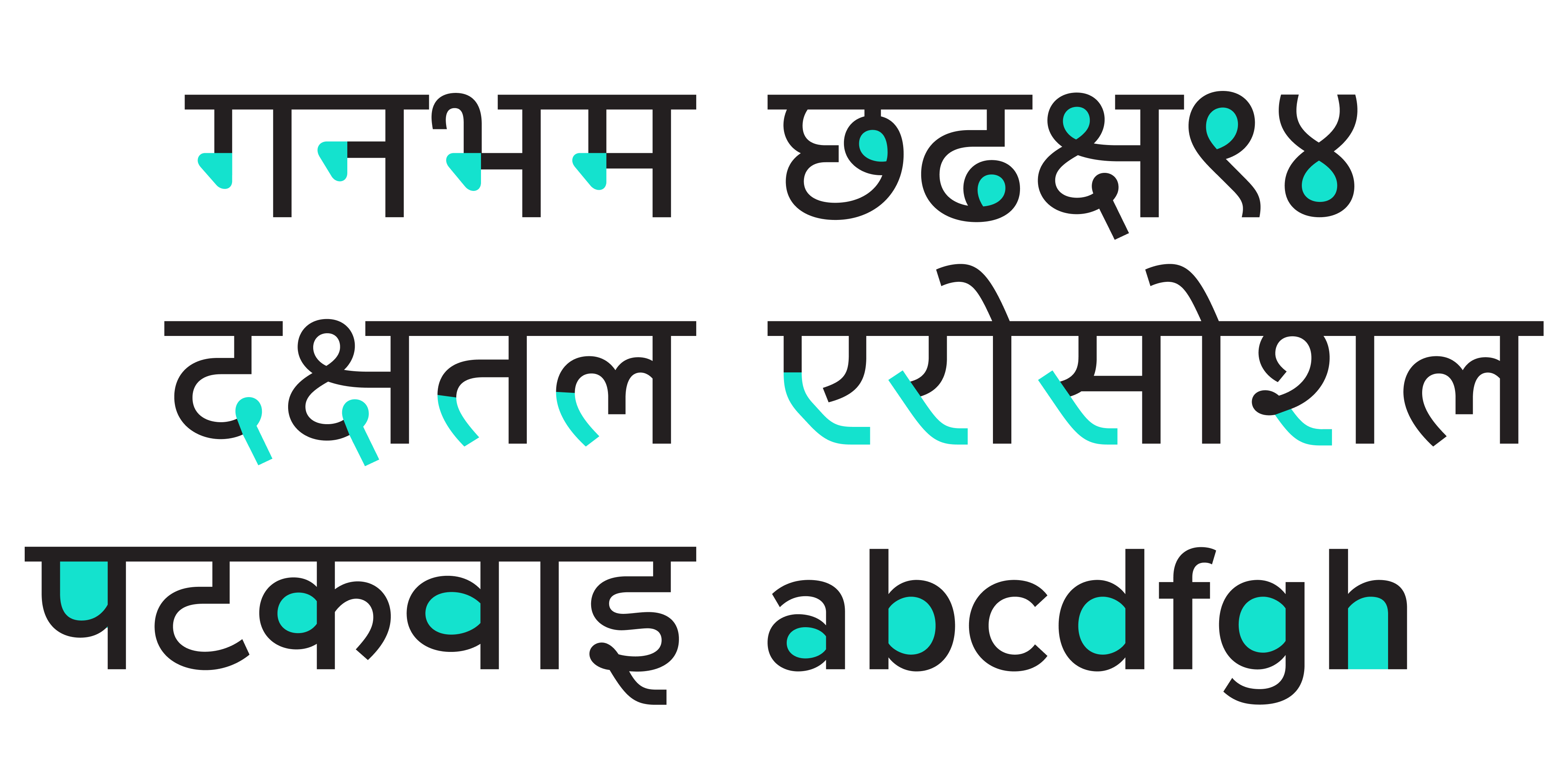
Devanagari is a script with distinct features: a strong headline (shirorekha), a vertical rhythm, and a logic of letter construction that differs significantly from Latin. Many typeface extension projects fall into the trap of mimicry, forcing Devanagari into a Latin mould. Our approach was different: let Devanagari speak in its own voice while developing a stylistic and tonal balance with Proxima Nova.
This meant understanding and accepting differences in construction, not just graphically replicating features between unrelated scripts. The Latin original offers rounded shapes and a large x-height, and in response the Devanagari design demands different proportions and alignments. We didn’t try to replicate the geometry of Proxima Nova’s strokes directly. Instead, we translated its visual tone, its evenness, its proportions, and strong rhythm, into something that makes sense within the logic of Devanagari letterforms.

Design with understanding
One of the key decisions was to avoid over-stylising and one-to-one graphic correspondence between scripts. Many Devanagari typefaces exaggerate shapes and contrast in characters to make them look more like an existing Latin counterpart than sensibly related and refined Devanagari letterforms. It has also become common to find designs that simply end up replicating Latin strokes and features without recognising that they do not imply the same thing, nor function the same way, in Devanagari as they do in Latin.
This is often done without an understanding of what different characteristics like stroke modulation and contrast can mean when applied to different scripts. Proxima Nova was designed for versatility and longevity, so our focus was on drawing forms that were clear, proportionally consistent, and visually balanced within the relevant context of the language and script in question.
We worked carefully on stroke modulation, aperture widths, and relative proportions between the two scripts. Balancing the typographic colour and texture in continuous reading, considerations for the spacing, and the rhythm of typeset text were all essential to the process of refinement. The spacing was fine-tuned so that neither script feels too dense or too loose when set side by side. Unlike Devanagari typefaces that force overt graphic equivalence simply by removing features that are characteristic of the script, Proxima Nova Devanagari deploys knots, loops, and diagonal strokes in their rightful place, not only enhancing the reading experience but also the overall design.

Working across scripts
Multi-script type design is not just about drawing two scripts in parallel with the same features or basic stylistic approach. It is about designing systems that function together visually, structurally, and semantically – a process that has subtleties and nuances that go beyond graphic sameness. We tested Devanagari alongside the Latin constantly, fine-tuning the relative alignment zones, the weight balance, and the optical flow in multilingual settings to achieve a meaningful connection.
A good result, we believe, is not the outcome of a one-to-one matching exercise conducted purely through replicated features between scripts. Rather, a good multi-script counterpart is a thoughtful translation that makes sense of the original idea in the context of a particular script. Proxima Nova Devanagari is thus a companion that stands together with the rest of the family – it feels like part of the same system – but one that retains complete integrity on its own while complementing other scripts.

Why this should matter
As designers working with multiple scripts, we believe care, craft, and knowledge in designing typefaces benefits not only readers, brands, companies and their services, but it also ensures a positive future for multi-script typography.
At Typeland, we specialise in Indian scripts, and we take this work seriously. Our goal is to make sure that the typefaces we design not only hold their own in terms of distinctive design and practical applications but that our work also contributes to the larger framework of high-quality provisions across scripts for readers worldwide.
The Proxima Nova project is a small example of what it looks like to treat Indian scripts with the same design discipline and typographic care as Latin. We hope that projects like this lead to a shift towards greater typographic quality across linguistic boundaries.
Proxima Nova Devanagari is available for licensing at
https://www.marksimonson.com/proxima-super-nova/devanagari/
• • •
Typeland is a type design studio focusing on custom fonts and multi-script typography. Whether you need a custom design, retail font-library extension, or multi-script typefaces that perform across scripts, we’d love to talk – contact us with your requirements.