Shakespeare’s Globe 2022 Summer Campaign
The summer 2022 season campaign for Shakespeare’s Globe in London, is a fresh take on plays so well-known, so seemingly timeless, that they truly require no introduction. Graphically pushing things forward by some distance, this new campaign is a marked departure from previous approaches that employed muted colour palettes (predominantly black, white, and red) with minimal use of photography. With a burst of colours and strong, character-driven imagery, the campaign reframes Shakespear’s plays for the post-pandemic stage. As we know too well, the pandemic affected most aspects of everyday life, but it has had a particularly adverse effect on the Arts sector, with venues for communal gathering and audience-oriented activities facing uphill struggles all through the duration. In a period of relatively low tourism, the key audiences for the theatre were not the usual mix of tourists and visitors on the South Bank of the river Thames but mostly Londoners and local communities. The approach to the campaign design also had to evolve in order to address this change in focus, and engage local audiences anew.
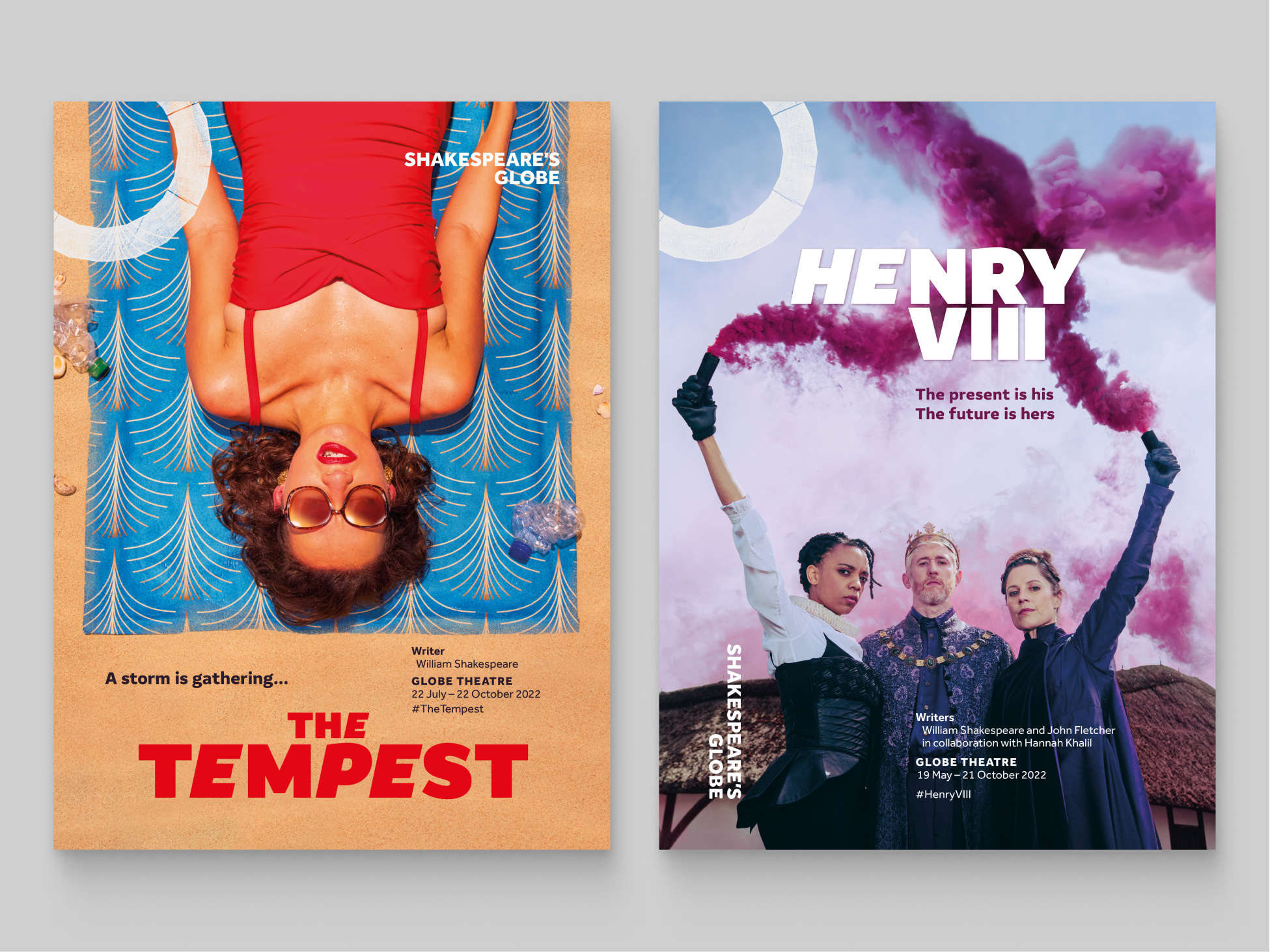
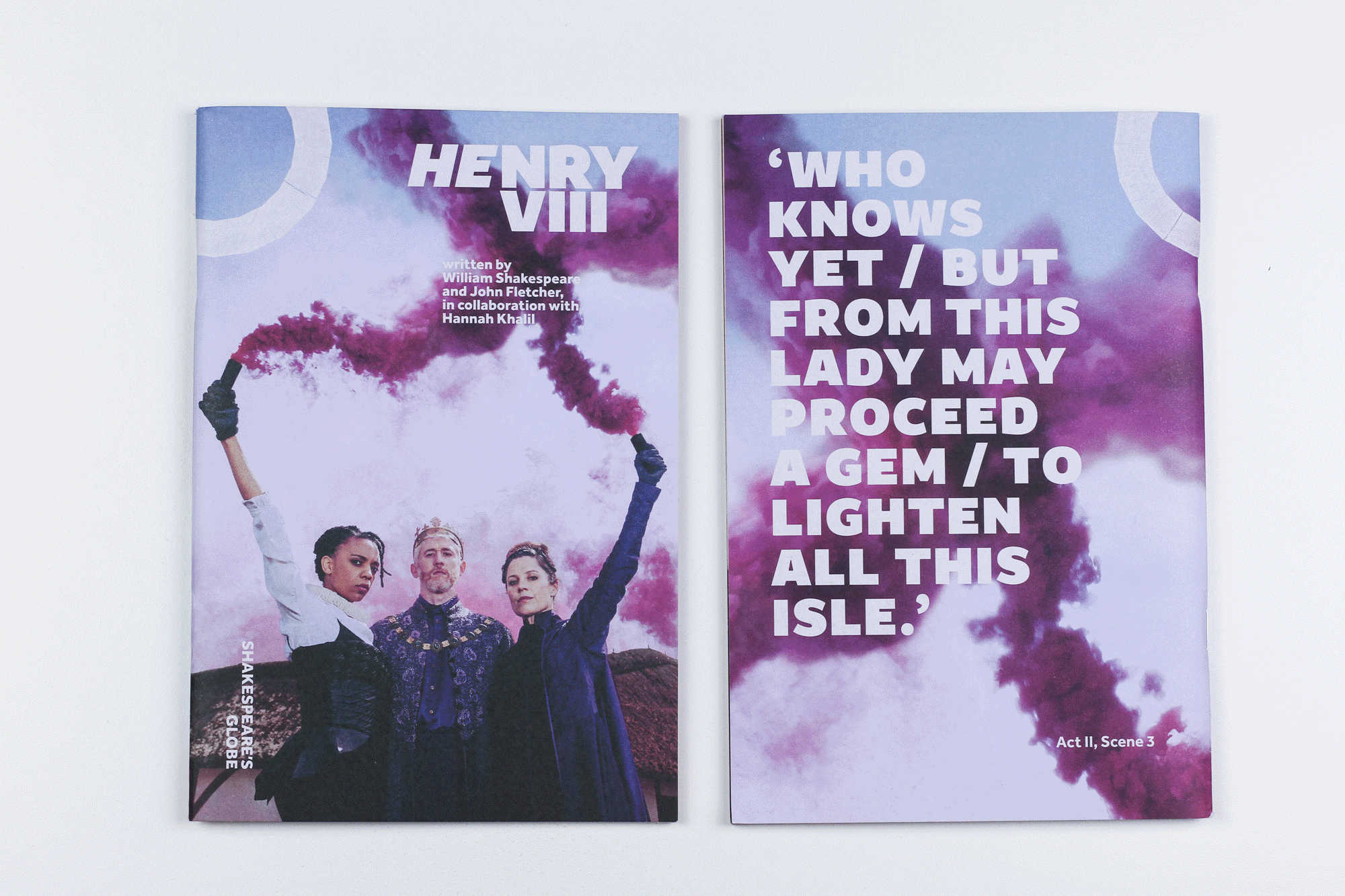
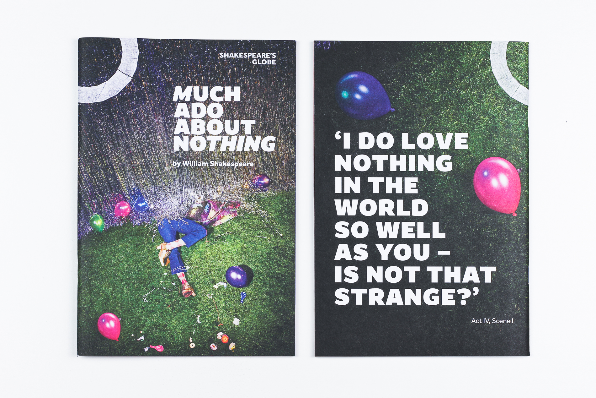
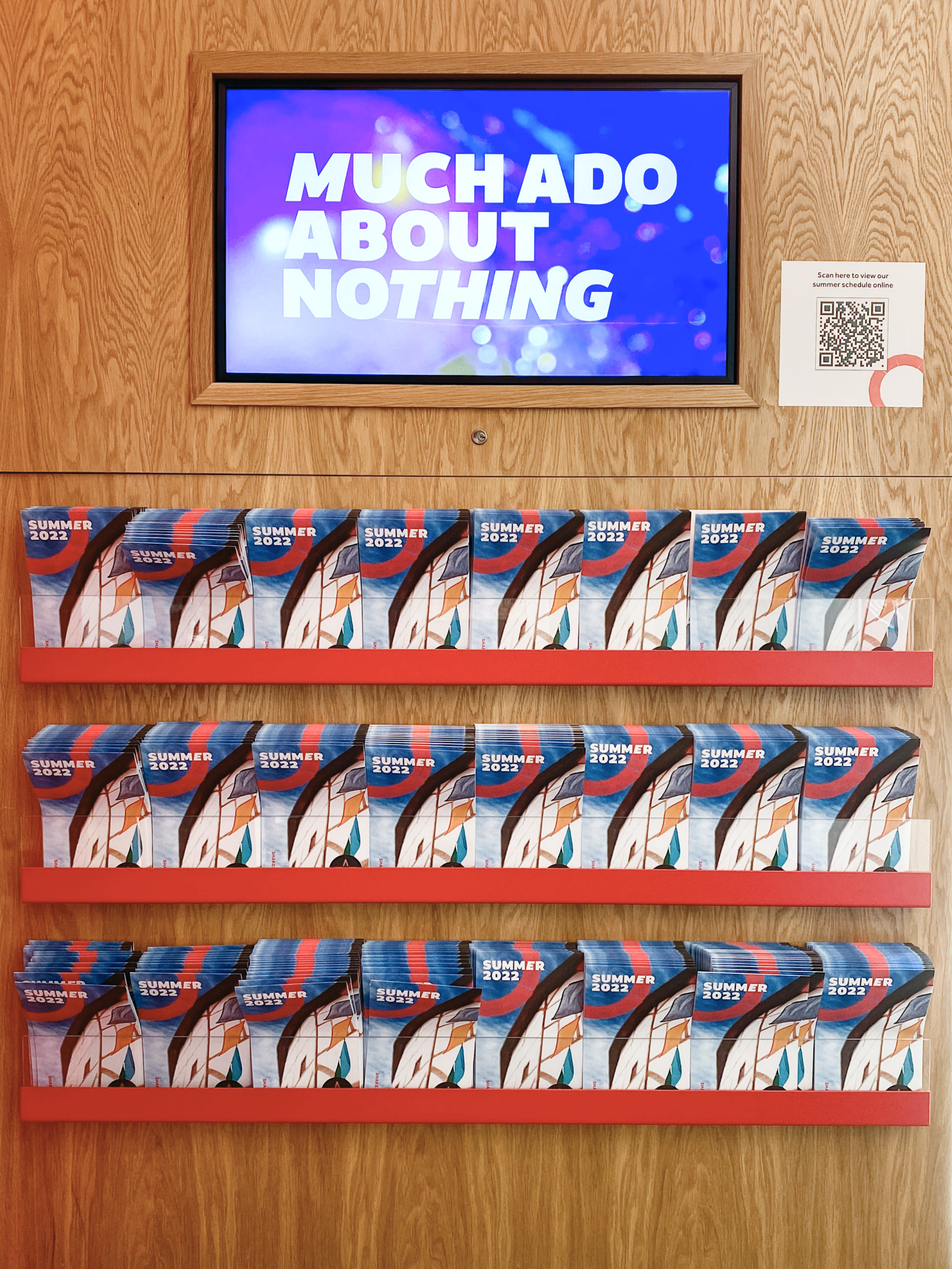
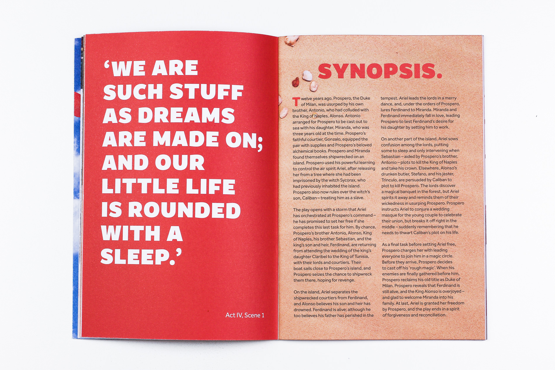
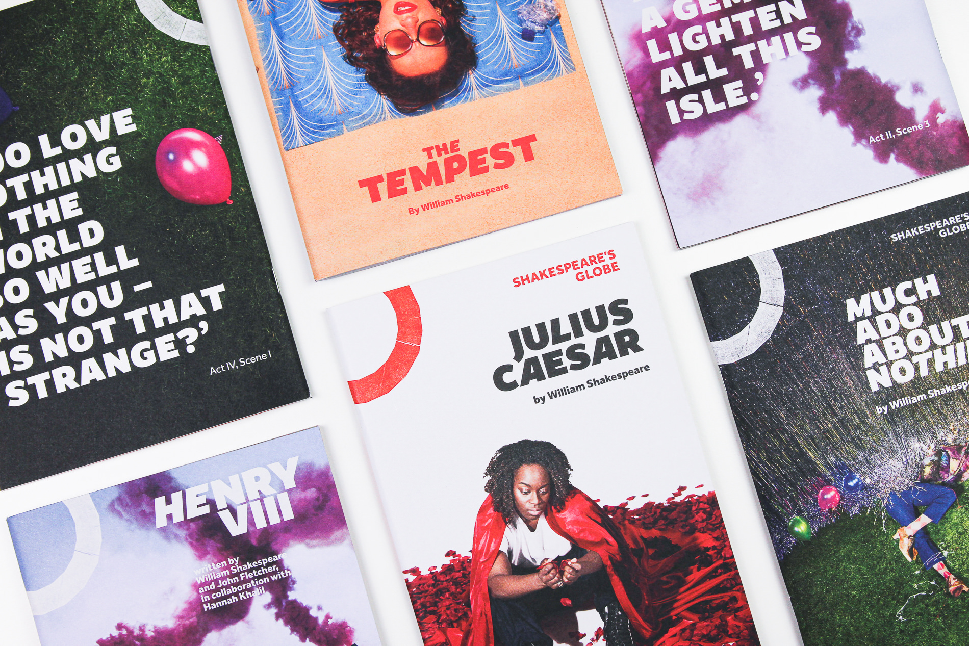
For the title treatment of all posters, the Globe’s design director Irene Omodeo Zorini chose Typeland’s Amifer, used in an inspired combination of Black and Black Italic. The styling is helped by Amifer’s generous, squarish proportions that naturally let the titles breathe while asserting a clear presence in relation to other visual elements. The design puts to use Amifer’s quirky details and curves that give a subtle personality to the the titles without overshadowing the rest of the design. The mix of upright and italic styles is also a nod to the identity of the theatre, as traditionally the visual language of the Globe has used subtle angles and angular elements to great effect.
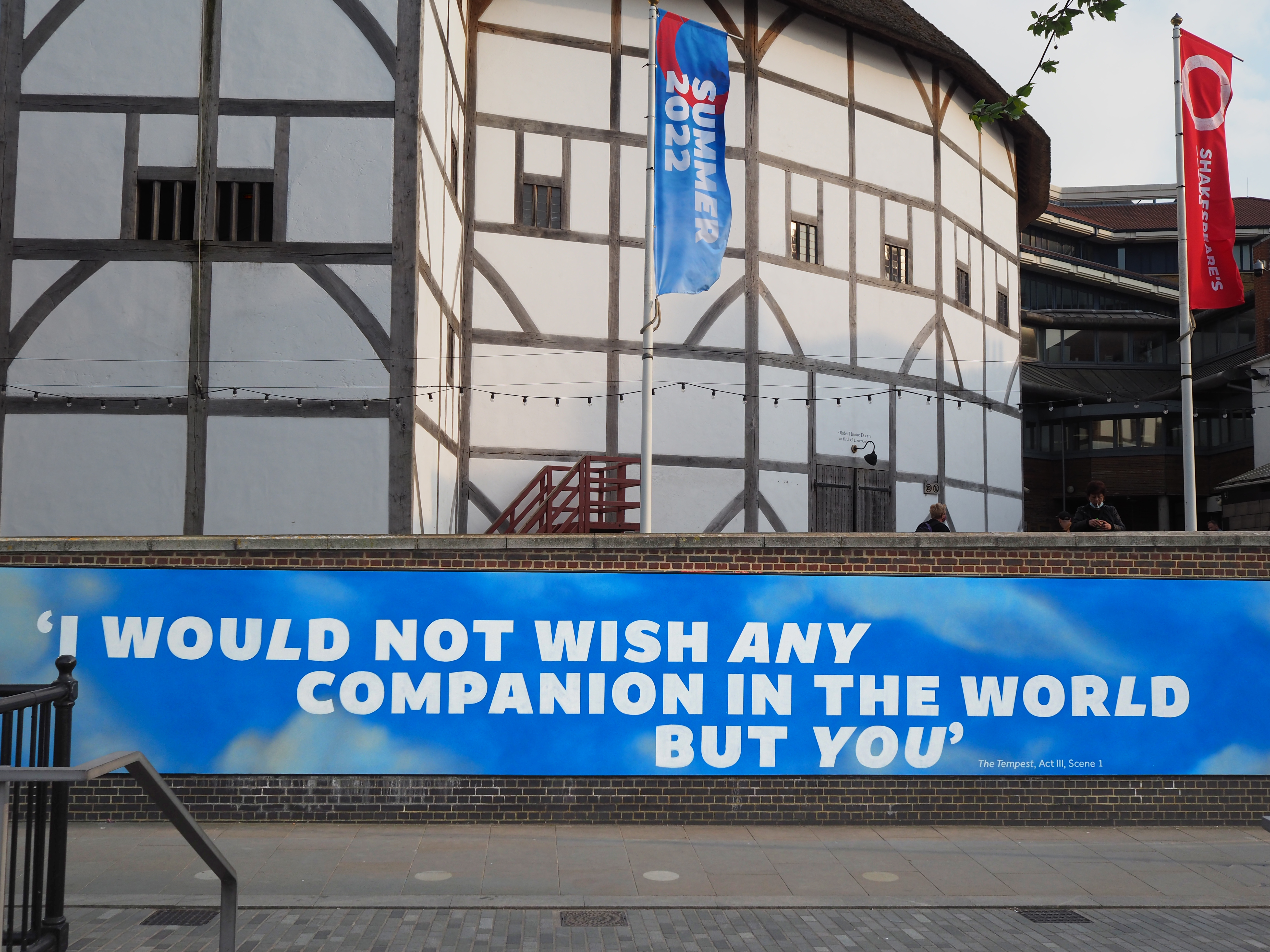
Amifer is used throughout the series for collateral material, banners, brochures, programs, and flags – and even a gigantic mural just outside the theatre. It is a pleasure for us to see it in use, of course, but if you’re in London or visiting, you too can check it out on your walk along the Thames one day and share some type love.
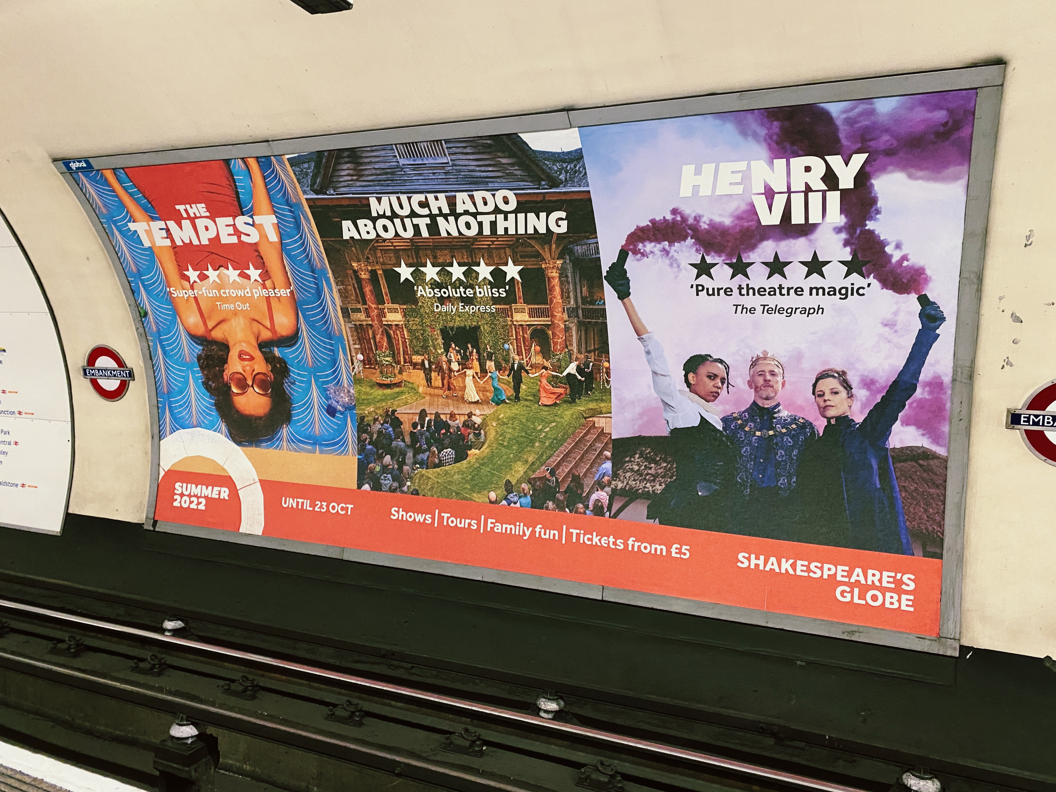
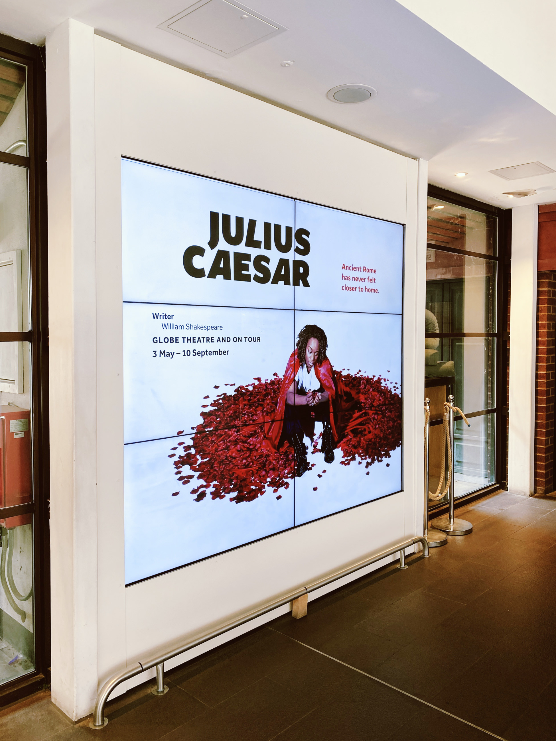
You can probably also spot Amifer at one of several underground stations where the Globe’s large format posters advertise the Summer 2022 programme (the above was spotted at Embankment). And, as if we weren’t already excited about this campaign, Amifer will also feature in the upcoming Winter programme! We cannot wait to see what (typo)graphic delights that will bring, but we will post further updates here and elsewhere when that happens – stay tuned for more.
Amifer is like a pair of black trousers in a wardrobe — Irene Omodeo Zorini
Typeland is an independent type design studio based in south London. See our library of retail fonts and get in touch with us for any enquiries or custom design projects. We are always happy to discuss potential collaborations – contact us with your requirements.