Interview: MiSans Global
MiSans is a bespoke multi-script typeface commissioned for Xiaomi, the Chinese multinational technology company known for its smartphones, consumer electronics, and smart home devices. This ambitious project began at Monotype by substantially extending MiSans Latin, originally designed by Hanyi Fonts, to deliver seamless support across a diverse range of scripts. The goal of this extensive project was to ensure a clear and consistent brand voice across Xiaomi's vast global and regional markets, which called for a cohesive design for the complex Japanese and Korean characters alongside Indic and Southeast Asian scripts. The project now features meticulously crafted typefaces covering Devanagari, Bengali, Gurmukhi, Gujarati, Odia, Tamil, Telugu, Kannada, Malayalam, Thai, Lao, Japanese (Kanji, Hiragana, Katakana), and Korean (Hangul, Hanja). Monotype managed the development and execution of this project.
To ensure cultural relevance and technical precision across all regions, Monotype partnered with specialist designers who brought deep regional and script expertise. The Indic scripts were made in collaboration with Vaibhav Singh and Alessia Mazzarella from Typeland. Thai and Lao scripts were developed with Cadson Demak. The Monotype specialist CCJK team expertly managed the intricate design, refinement, and engineering of the complex Japanese and Korean characters, led by in-house designers Ryota Doi, Tao Di, and Chorong Kim, with invaluable contributions from external Hangul expert Jin Yoo. This collaborative effort ensured that the unique requirements of each script family were met while maintaining MiSans’ core design principles.
The following text is Typeland’s part of the interview, originally conducted post-project by Monotype with Xiaomi and the collaborating designers.
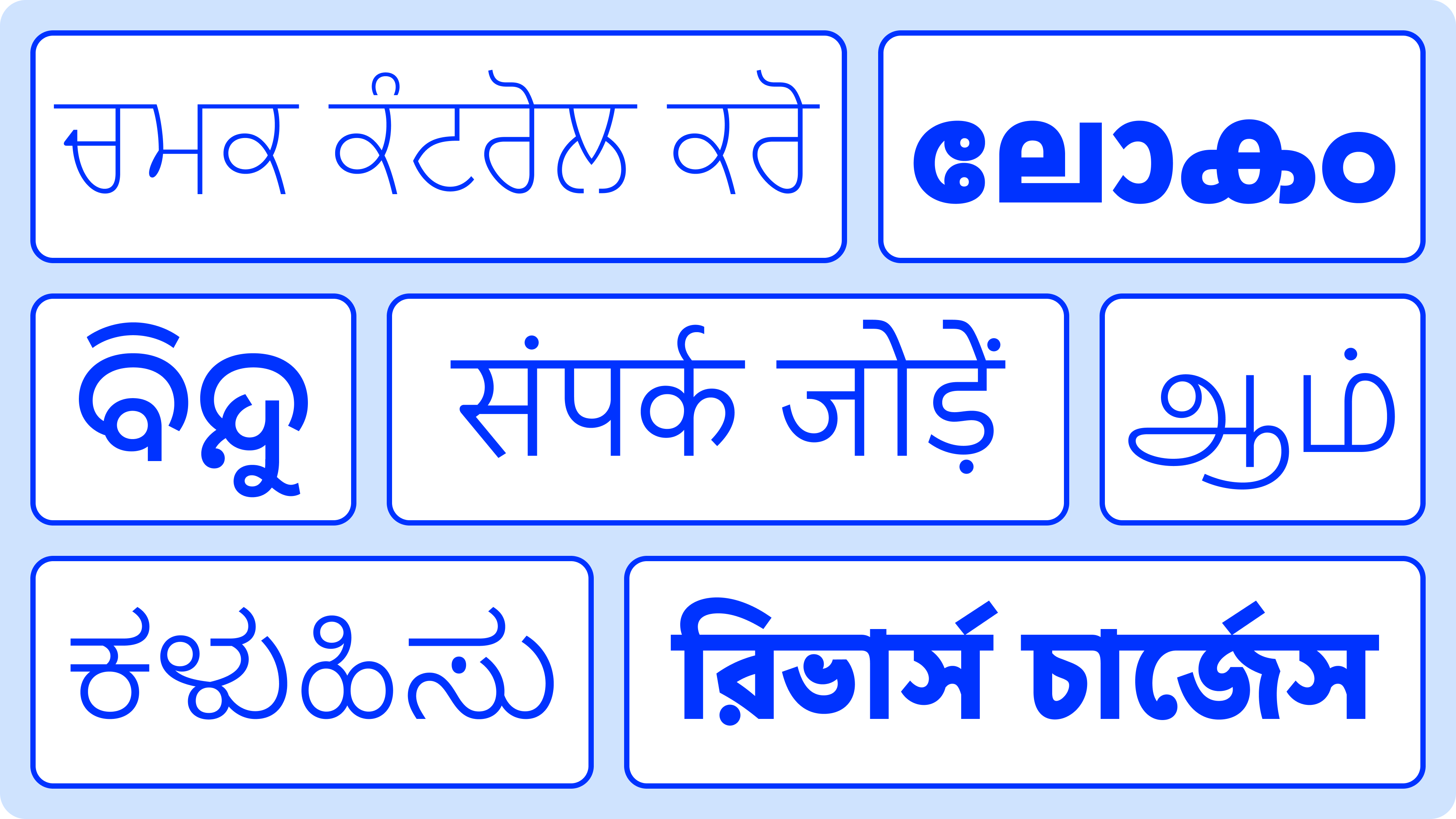
Tell us about yourselves and how you perceived the goals and scope of this project.
At Typeland, we specialise in multi-script type design, with a particular focus on Indic scripts. With our experience designing typefaces for a global clientele, we bring specialist knowledge to multi-script design, with culturally sensitive and high-performing results. So for us, the MiSans project felt like the perfect match, or dream scenario! The project was about more than simply extending a Latin font; it was about ensuring that millions of people across South and Southeast Asia experience a consistent and deeply considered brand voice in their own languages. The scope was ambitious, covering a wide range of scripts, each with its own traditions and complex structures. Our goal was to balance the brand voice with typographic integrity and achieve effective results for a related suite of Indic typefaces. We wanted each script to feel authentic, not just adapted, while also producing typefaces that work seamlessly together in user interfaces and across devices.
What are the key considerations in achieving visual harmony? Were there any technical challenges or functional adjustments made to improve performance, especially for screen use? Finally, are there any interesting insights or unexpected factors from the process?
The first step is to recognize that achieving visual harmony or ‘matching’ the design characteristics does not mean cloning shapes or mimicking the construction of existing Latin shapes. South Asian scripts like Devanagari or Tamil are not subsets of Latin; they have their own logic of construction, relative proportions, stroke contrasts, typographic textures, and rhythm. The challenge is to identify the tone of the Latin, as it is expressed in the stylistic warmth of a humanist sans, the openness of the counters, and so on, and then interpret that tone through the appropriate structure of letterforms for each script.
To make MiSans Indics work well in their UI context, we took the direction of crisp, clean letterforms that reflect the important individual characteristics of each script without compromising distinguishing features such as knots, loops, and joints that are often sacrificed in the name of ‘matching’ scripts to Latin. We emphasised clarity, simplified detailing to achieve a tonal connection across scripts, and harmonized proportions to hold up well at small sizes and to retain a balanced presence across weights.
We tested across weights, sizes, and rendering environments to ensure consistent legibility and overall functionality. In some cases, we adjusted character widths, rebalanced joints, or engineered conjunct forms to perform more reliably with alternative solutions. The UI environment and the intended use of the fonts in the overall system determined the vertical proportions that we worked with. We took particular care in refining the design for greater clarity, optimizing smaller counters to perform well even in tricky situations.
An insight we kept coming back to is that visual harmony and clarity emerge from respecting difference. The letterforms of different scripts don’t need to be exactly identical or mimic specific shapes to look connected or related. They need to feel and function like parts of the same system: a quality that MiSans fonts achieves through a solid understanding of the basic principles of letter construction and careful calibration of individual features. That approach shaped many of our design decisions.
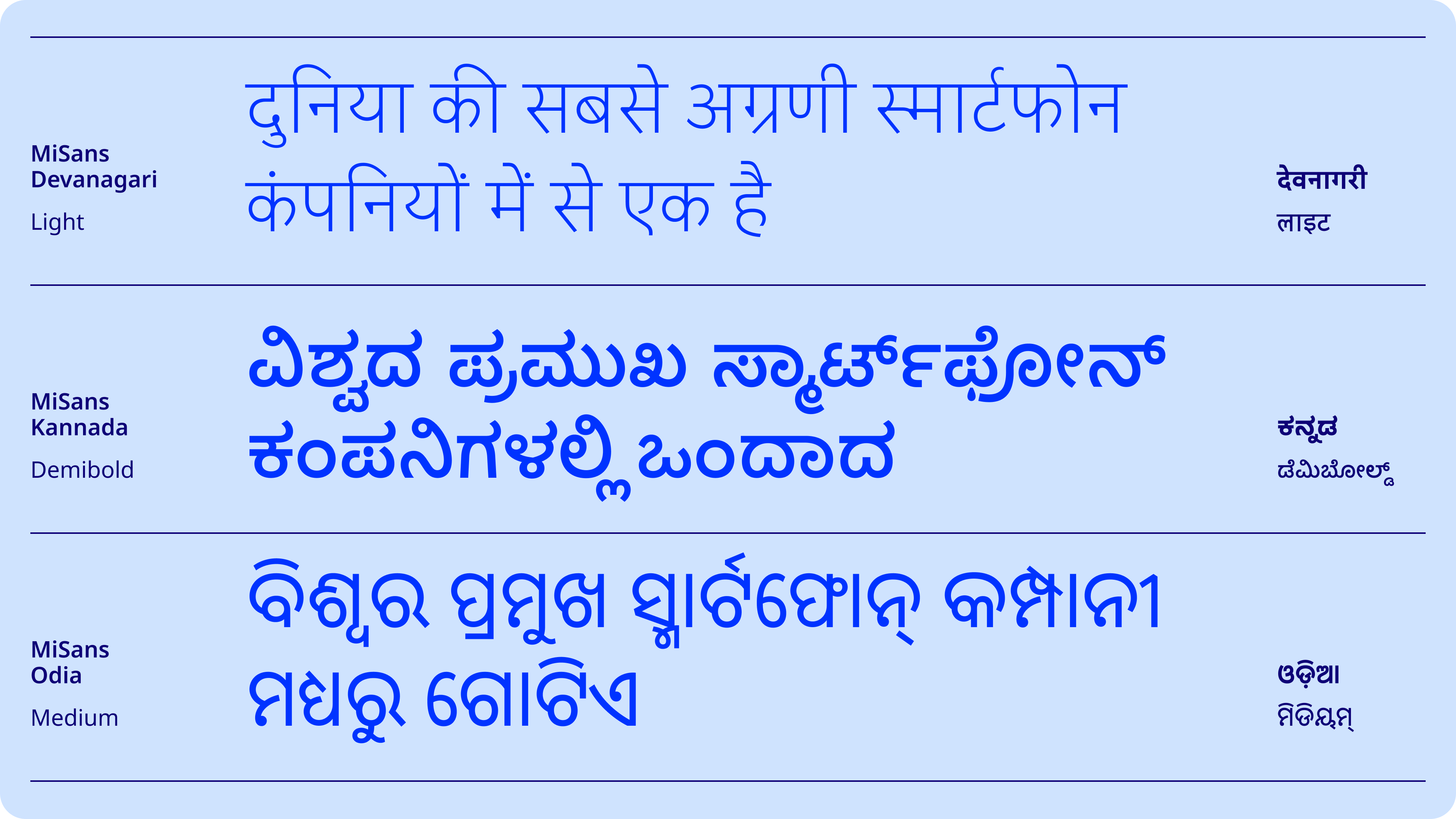
Could you share some insights into the process behind developing this typeface.
Our process is always research-driven. We began with script analysis to understand how each script’s features might be interpreted through, or interact with, the framework of a humanist sans design. We then mapped core design decisions like relative proportions, stroke modulation, counters, and so on against both the Latin and the script’s own conventions. Balancing those ideas across multiple scripts was a nice challenge, and it required constantly keeping the bigger picture in sight while working on the details and individual features.
The master setup and weight range added another layer of complexity, since every design decision needed to interpolate cleanly across the weights but also in a connected way across scripts. Beyond the design aspects, the syllabic structure of Indic scripts requires additional care in font engineering and testing, since characters often combine and are re-shaped or reordered. This meant extensive testing to ensure positioning, substitution, and OpenType features all performed reliably across environments. We built detailed proofing documents and tested on multiple browsers and platforms to ensure that high-quality typographic design is combined with top-level functionality.
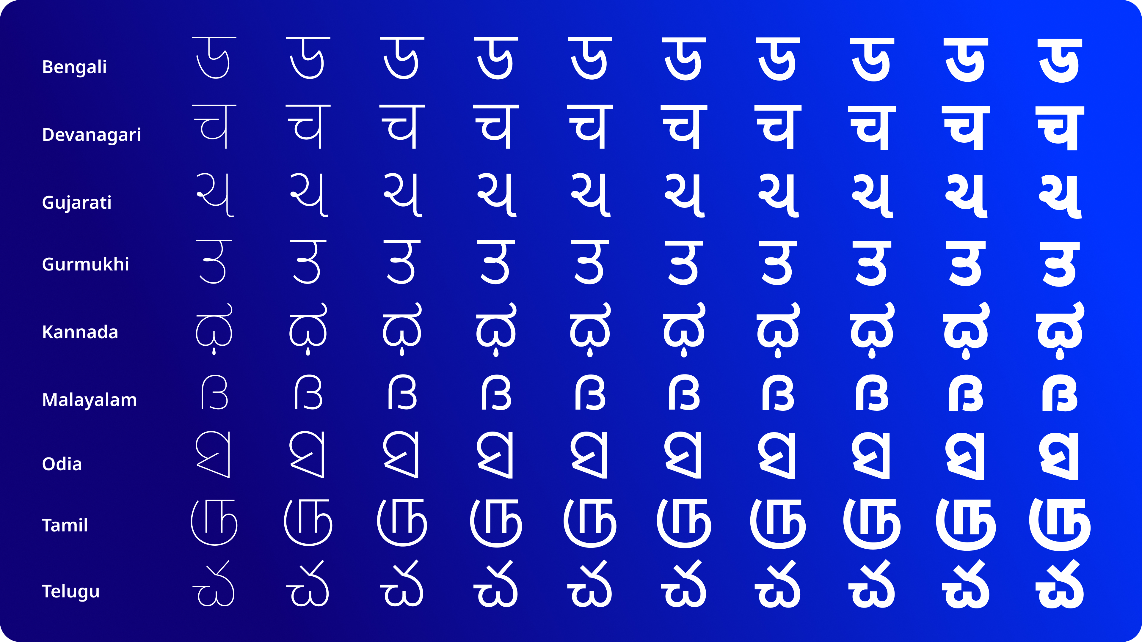
What challenges or takeaways stood out? Whether related to timelines, technical hurdles, cross-regional collaboration, learning unfamiliar scripts, or engineering work?
Working on multiscript type families is always challenging but exciting. It means designing in parallel across scripts while constantly aligning and adjusting the overall tone and consistency of the design. We particularly dreaded the challenge of coming up with a system to keep track of all the minute, incremental changes that trickle down and affect several hundred characters, which then need to be translated across scripts, but we actually ended up enjoying the process of efficiently managing all of that! Another challenge was that the conjunct behavior and mark placement in Indic scripts required careful testing to avoid performance issues. Even tiny errors or oversights disrupt proper functionality, so we learnt to be extra vigilant about small but significant issues that could affect the fonts in different environments.
We also collaborated closely with the Xiaomi team, who were always ready with feedback and beta-tested fonts throughout the project. The process was structured so they had ample time for testing at their end while we advanced other parts of the work. That rhythm of exchange made communication across teams efficient and productive, and built a double layer of quality assurance for the end result. The Monotype team managed the project expertly, ensuring precise scheduling and delivery. It also meant clear, effective interactions about design decisions throughout the project and swift confirmation of their suitability for the clients’ needs.
The key takeaway from this experience is that multi-script projects demand not just technical skill but also trust and clear communication between all partners. You can’t have a shortcut to the process of understanding scripts and their specific requirements, but you can structure collaboration in ways that make ambitious outcomes possible, with effective results delivered within desired timelines.
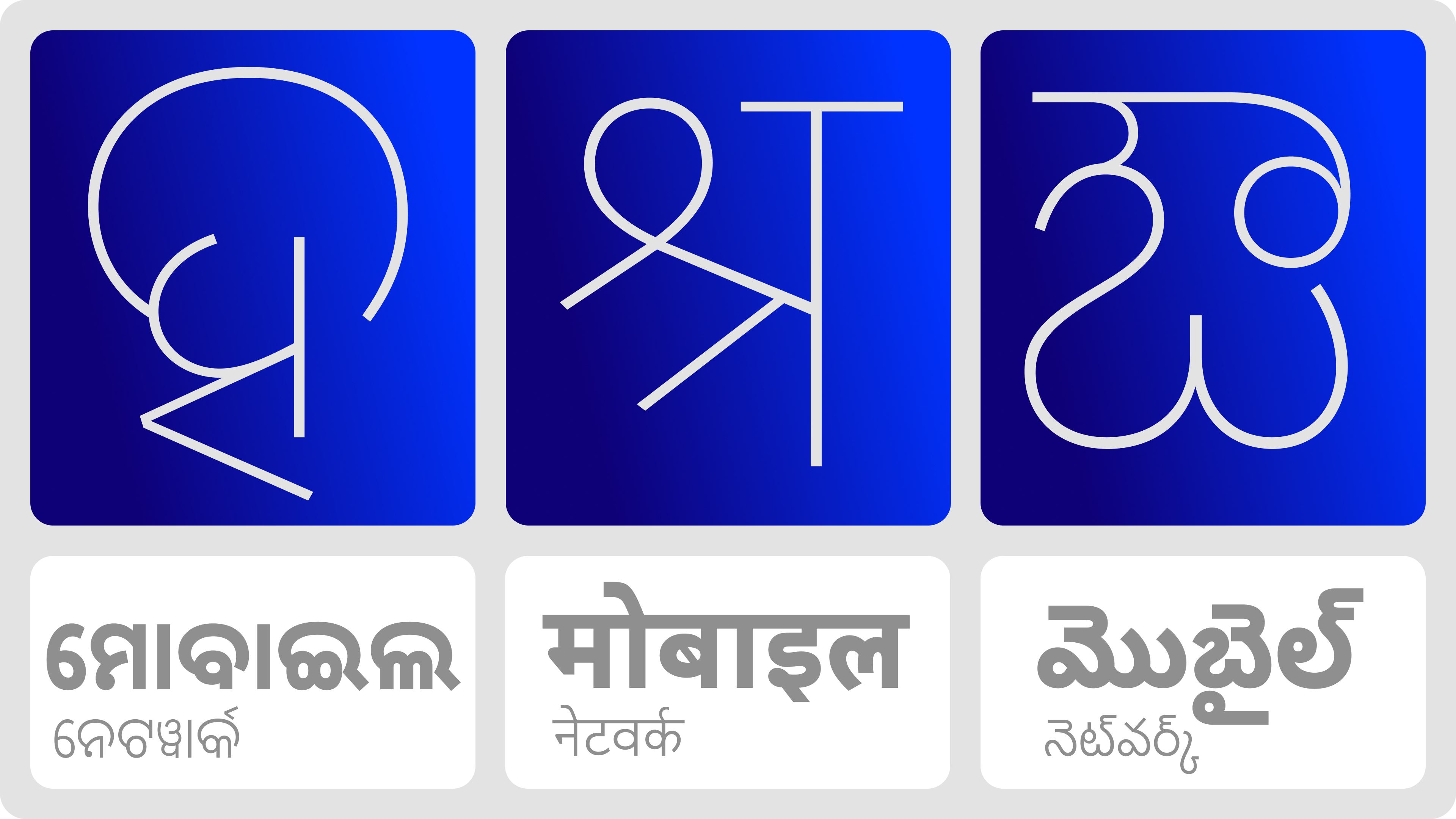
What would you urge the industry to do differently or more consciously to uplift and support the diverse needs of regional scripts and languages?
We would urge the industry to move away from treating Indic scripts (or any script other than Latin) as secondary. Too often, projects for global scripts are framed merely as a requirement for localization, as if adding scripts is just about expanding reach and covering the bare minimum necessities. But for users around the world, language and messaging is visually encountered on a day-to-day basis through typefaces. Designing high-quality typefaces is central to all text-based communication, so typefaces for Indic scripts cannot be an afterthought, and they should not be treated as secondary or optional add-ons.
That means budgets, timelines, project scopes, and expectations should reflect the real value of multi-script work, recognizing what it adds to any brand. It also means valuing design expertise and intercultural connections, and ensuring that typefaces are not just technically functional but culturally resonant products.
Finally, we would like to see broader recognition that the diversity of scripts is not an ad hoc problem to be solved with substandard solutions, but an opportunity for growth and meaningful exploration of the global possibilities of design. It is absolutely critical to recognize that each script has its own integrity and formal possibilities, which should be reflected in the quality of typefaces produced for it. When brands respect plurality and encourage typographic diversity, they build deeper and more authentic connections with their audiences.
• • •
Typeland is a type design studio focusing on custom fonts and multi-script typography. Whether you need a custom design, retail font-library extension, or multi-script typefaces that perform across scripts, we’d love to talk – contact us with your requirements.