Yestagon: no dead weight
Yestagon started as an exploratory project for a very specific purpose: to create a punchy typeface for the title of a journal, Contextual Alternate. The main idea was to explore the graphic qualities of a heavy, geometric, sans style but to infuse it with character and whimsy in ways that didn’t detract too much from an otherwise solid, stable appearance. The original title-lettering, which later developed into a full typeface, was meant to be printed on the journal’s covers by the silkscreen process, so clean cuts and clear geometric forms for the counters were key concerns from the beginning. In addition to punchy titles, the design had great potential for use in strong headlines, and the in-progress typeface has been used for that purpose not only in the journal but also on the Typeland website since its early experimental phase.
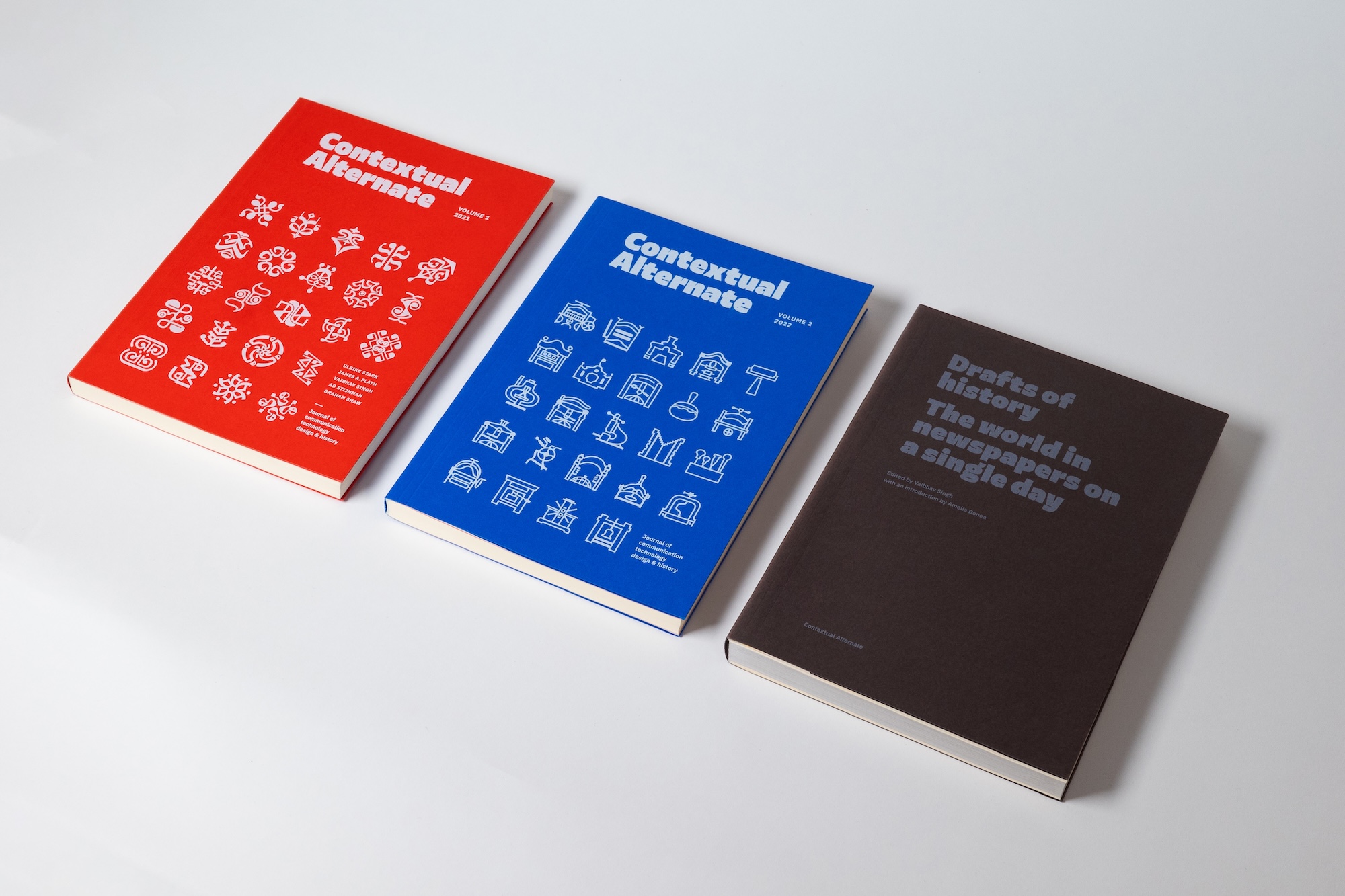
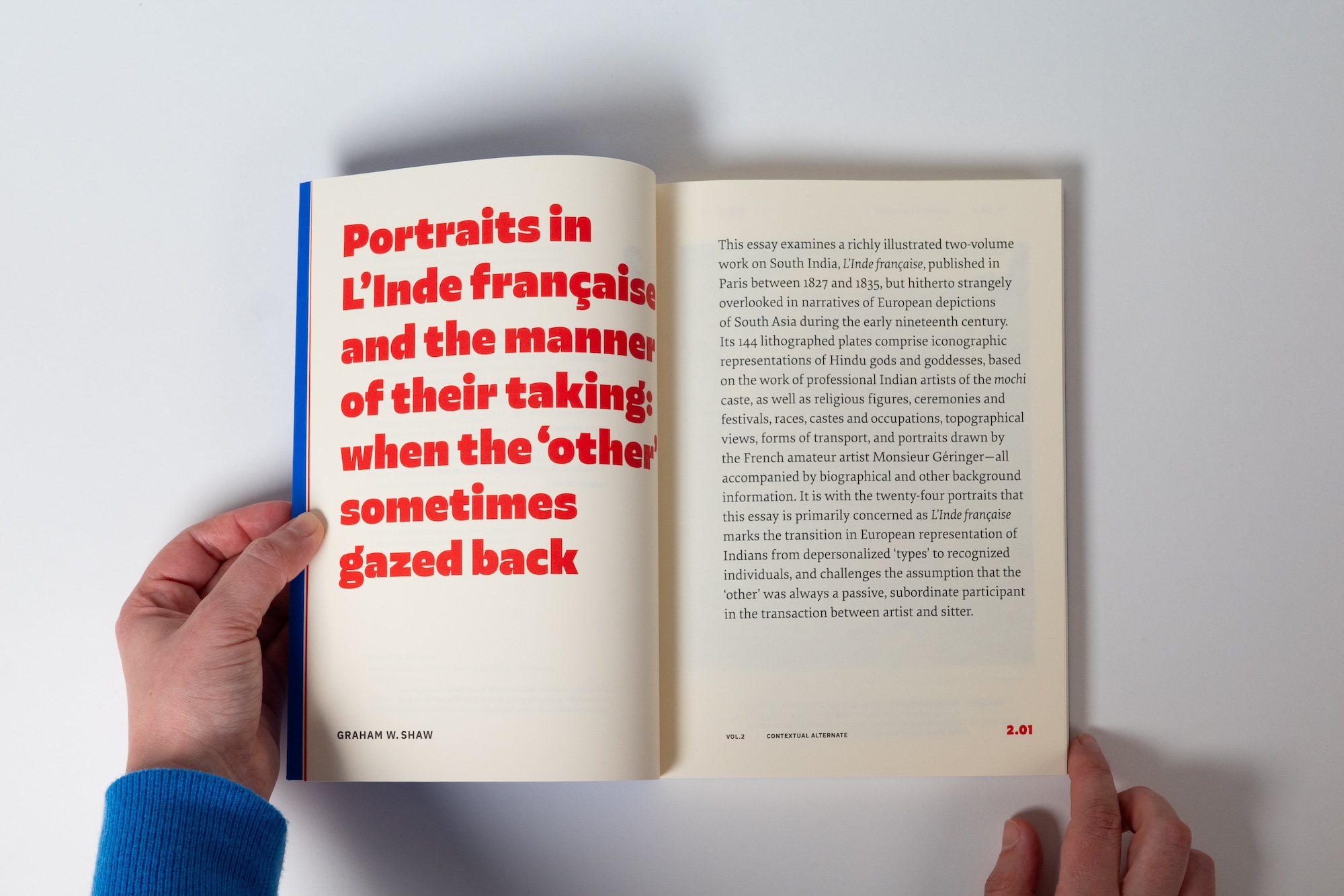
Following initial explorations, it became clear that the design’s sharp as well as non-sharp renderings in print evoked sufficiently different visual qualities to be thought of as connected but separate styles. This led to the development of two different treatments for Yestagon: one with sharp-edged strokes (Yestagon), and the other with rounded edges (Yestagon Soft). Each style retains the same level of clarity but offers a different flavour, responding to the initial idea of having a crisp heavy title that can also work nicely with a softer result characteristic of certain printing techniques or lo-fi renderings.
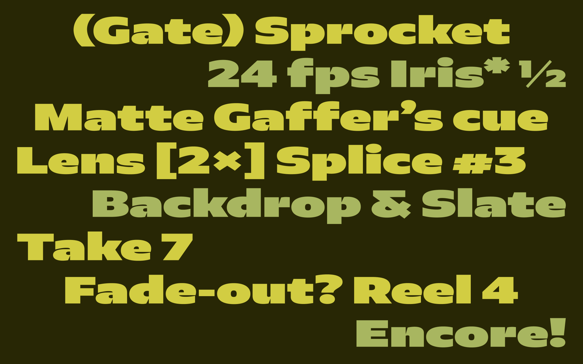
Trying to pack in as much weight as possible while retaining unobtrusive clear forms for the letters meant that a hybrid approach worked best in achieving overall balance across different shapes. On the one hand, sharp cuts in letters like ‘b’ and ‘d’, and starkly geometric counters in letters like ‘f’ and ‘g’ allow the design to retain heavy strokes to a greater extent where needed. On the other hand, squeezing the central strokes in letters like ‘e’ and ‘s’ allows for a comparable solidity in the overall forms without sticking to the idea of evenness and low contrast in all letterforms. This not only adds a touch of playfulness and stops the structure from becoming too rigid, but it also helps the design sit somewhere between the entirely-formal and the almost-informal, in terms of its style.
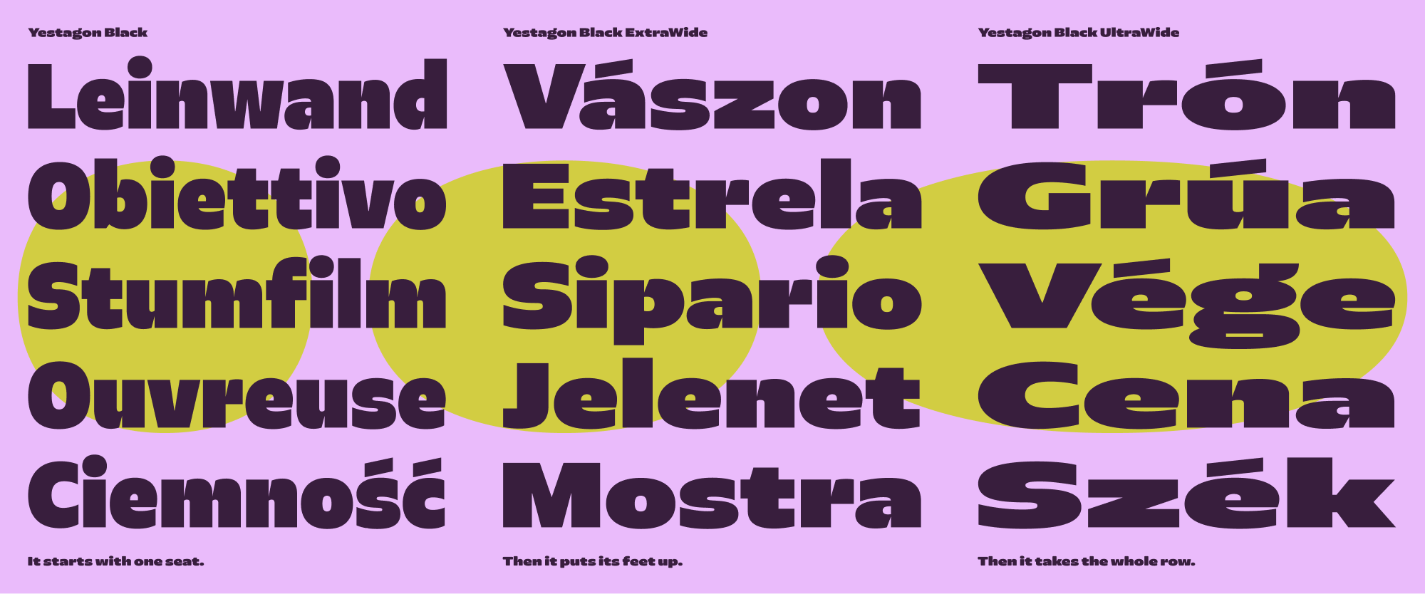
Originally designed for titles and punchy headlines, it was only natural for Yestagon to go from the page to the stage to the widescreen: with a set of widths that make a statement by themselves and can fulfil titling requirements to an extreme. Starting from a subtle shift in proportions in the Wide style that offers a more generous feel, the range progressively moves to the UltraWide, for occasions that demand nothing less than total spread. There are six widths, from Black to UltraWide, with UltraWide exactly twice as wide as Black.
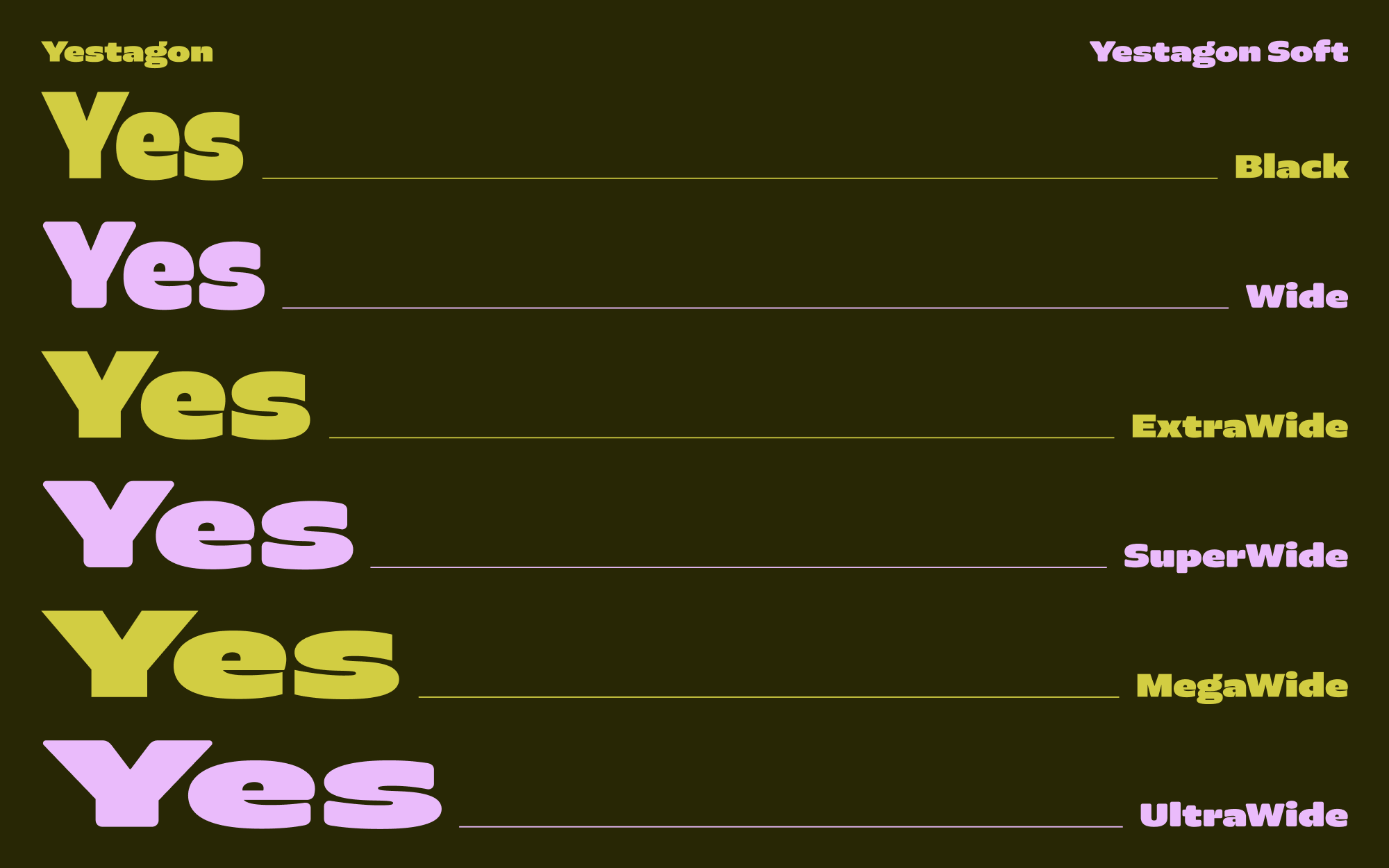
The design of Yestagon is one of those instances where the conventional range of light, regular, and not-particularly-bold bold styles do not add anything to the design – except dead weight, of course! That’s why Yestagon comes only in the Black weight that it was designed for, the weight that allows for something distinct to happen in the design. This ensures that the exact qualities and intended visual feel remain at the front and centre at all times, with no regulation weights to detract from the main idea of the typeface.
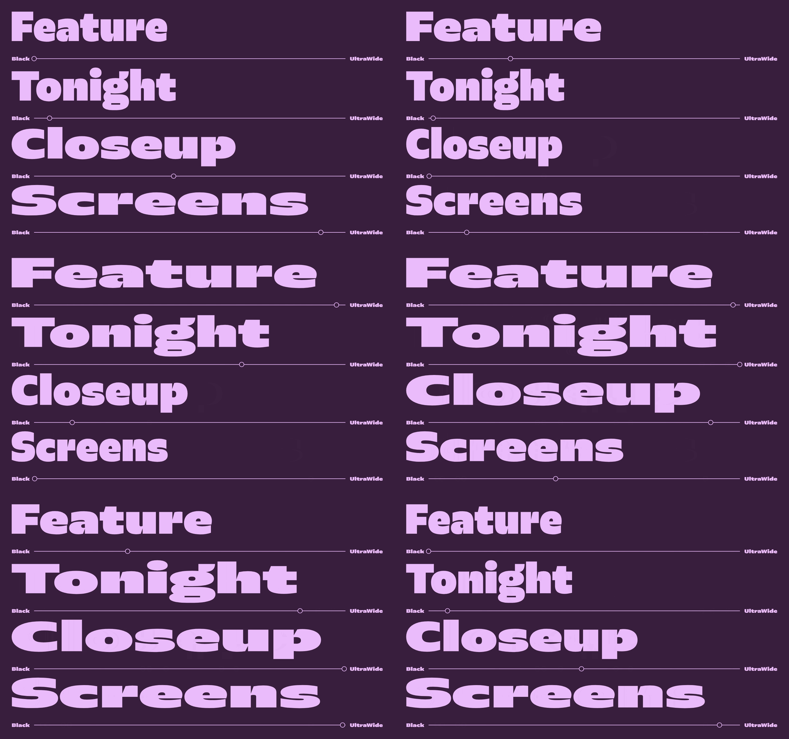
Yestagon and Yestagon Soft have 6 widths each: Black, Black Wide, Black ExtraWide, Black SuperWide, Black MegaWide and Black UltraWide. Total 12 styles, supporting 300+ languages. Designed by Vaibhav Singh. Fonts and free trials available on type.land/typefaces/yestagon
• • •
Typeland is a type design studio focusing on custom fonts and multi-script typography. Whether you need a custom design, retail font-library extension, or multi-script typefaces that perform across scripts, we’d love to talk – contact us with your requirements.